背景处理
背景样式
背景颜色
背景颜色可以使用 rga | rgba | 十六进制 等颜色格式
<style>
    h2 {
        background-color: red;
    }
</style>

<h2>hello world</h2>
1
2
3
4
5
6
7
2
3
4
5
6
7

背景图片
可以使用 png| gif |jpeg 等图片做为背景使用
background-image: url(bg.png);
1
背景裁切
background-clip: border-box;
1
背景图片在容器元素内所显示的区域,例如content-box表示背景图片只会在元素的内容区域显示 📌
| 选项 | 说明 |
|---|---|
| border-box | 包括边框 |
| padding-box | 不含边框,包括内边距 |
| content-box | 内容区域 |
背景重复
用于设置背景重复的规则
| 选项 | 说明 |
|---|---|
| repeat | 水平、垂直重复 |
| repeat-x | 水平重复 |
| repeat-y | 垂直重复 |
| no-repeat | 不重复 |
| space | 背景图片对称均匀分布 |
background-repeat: repeat-y
1
背景滚动
📗 background-attachment用于设置在页面滚动时的图片处理方式。(在父元素的容器大小限制之下,子元素内容超出滚动,并且带有背景图的情况)
| 选项 | 说明 |
|---|---|
| scroll | 背景滚动 |
| fixed | 背景固定 |
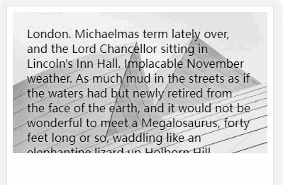
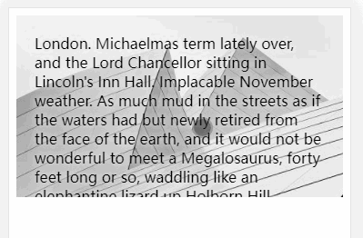
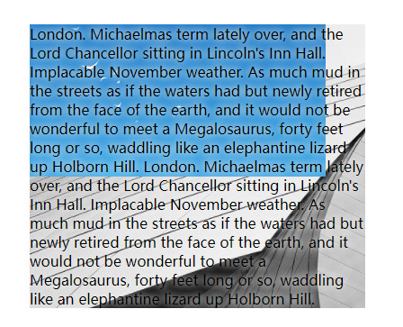
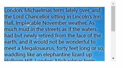
scroll
<style>
    main {
        height: 200px;
        overflow: auto;
    }
    .content {
        /* scroll跟随内容滚动 */
        background-attachment: scroll;
        background-image: url(bg.png);
        padding: 20px;
        text-shadow: 0 0 0.6rem #ddd, 0 0 0.6rem #fff;
    }
</style>

<main>
    <div class="content">
        London. Michaelmas term lately over, and the Lord Chancellor sitting in Lincoln's Inn Hall. Implacable November
        weather. As much mud in the streets as if the waters had but newly retired from the face of the earth, and it
        would not be wonderful to meet a Megalosaurus, forty feet long or so, waddling like an elephantine lizard up
        Holborn Hill.
    </div>
</main>
1
2
3
4
5
6
7
8
9
10
11
12
13
14
15
16
17
18
19
20
21
22
23
24
25
26
2
3
4
5
6
7
8
9
10
11
12
13
14
15
16
17
18
19
20
21
22
23
24
25
26
fixed
background-attachment: fixed;
1
背景位置
background-position用于设置背景图片的水平、垂直定位。
| 选项 | 说明 |
|---|---|
| left | 左对齐 |
| right | 右对齐 |
| center | 居中对齐 |
| top | 顶端对齐 |
| bottom | 底部对齐 |
居中对齐
background-position: center;
/* 或 X Y  */
background-position: 50% 50%;
1
2
3
2
3
水平居右,垂直居中
background-position: right center;
/* 或 X Y  */
background-position: 100% 50%;
1
2
3
2
3
使用具体数值定义
background-position: 100px 100px;
/* 也支持使用负值  */
background-position: -200px 100px;
1
2
3
2
3
实例
background-attachment: fixed;
background-image: url(bg.png);
background-size: 200px 100px;
background-repeat: no-repeat;
background-position: 80px 70px;
1
2
3
4
5
2
3
4
5
背景尺寸
| 选项 | 说明 |
|---|---|
| cover | 背景完全覆盖,可能会有背景溢出 |
| contain | 图片不溢出的放在容器中,可能会漏出部分区域 |
指定数值定义宽高尺寸
background-size: 50% 100%;
/* 或 Width Height  */
background-size: 200px 200px;
1
2
3
2
3
宽度固定高度自动
background-size: 50% auto;
1
多个背景
后定义的背景置于底层
background-image: url(bg1.png), url(bg.png);
1
多属性定义
background-image: url(bg1.png), url(bg.png);
background-repeat: no-repeat;
background-position: top left, right bottom;
1
2
3
2
3
可以一次定义多个背景图片。
background: url(bg1.png) left 50% no-repeat,
                url(bg.png) right 100% no-repeat red;
1
2
2
实例
background-image: url(bg1.png),url(bg.png);
background-repeat: no-repeat;
padding: 40px;
background-clip: content-box;
1
2
3
4
2
3
4
组合设置
可以使用一条指令设置背景
background: url(bg1.png) no-repeat content-box fixed;
1
盒子阴影
可以使用 box-shadow 对盒子元素设置阴影,参数为 水平偏移,垂直偏移,模糊度,颜色 构成。
box-shadow: 10px 10px 5px rgba(100, 100, 100, .5);
1
颜色渐变
线性渐变
激变一般用在背景颜色中使用(默认渐变角度是从上向下)
background: linear-gradient(red, green);
1
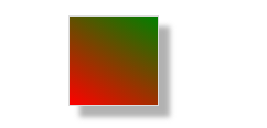
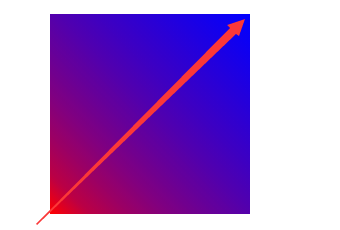
渐变角度
background: linear-gradient(30deg, red, green);
1
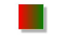
向右渐变
background: linear-gradient(to right, red, green)
1
向左渐变
background: linear-gradient(to left, red, green);
1
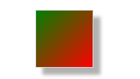
左上渐变
background: linear-gradient(to top left, red, green);
1
右下渐变
background: linear-gradient(to right bottom, red, green);
1
设置多个颜色
background: linear-gradient(red, rgb(0, 0, 200), green, rgba(122, 211, 100, 0));
1
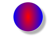
径向渐变
设置渐变
background: radial-gradient(red, blue, green);
1
设置渐变宽度与高度
background: radial-gradient(100px 200px, red, blue, green);
1
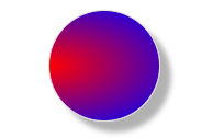
左下渐变
background: radial-gradient(at bottom left, red, blue);
1
右下渐变
background: radial-gradient(at bottom right, red, blue);
1
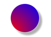
左侧向中心渐变
background: radial-gradient(at center left, red, blue);
1
底部向中心渐变
background: radial-gradient(at 50% 100%, red, blue);
1
标识位
颜色未指定标识时,颜色会平均分布。
红色与蓝色在50%和60%间发生激变.
background: linear-gradient(45deg, red 50%, blue 60%);
1

标识位相同时将没有过渡效果
background: linear-gradient(45deg, red 50%, blue 50%, blue);
1

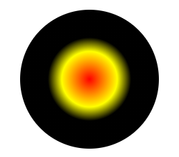
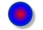
径向标识位绘制小太阳
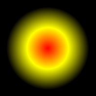
width: 150px;
height: 150px;
background: radial-gradient(red 0, yellow 30%, black 60%, black 100%);
1
2
3
2
3
通过在两个颜色间中间点定义过渡位置
background: linear-gradient(45deg, red, 30%, blue);
1
渐变重复 💡
下例定义从0到50px为蓝色,50px到100px的黄色,并进行重复后产生渐变的进度条。

background: repeating-linear-gradient(90deg, blue, blue 50px,yellow 50px,yellow 100px);
1
径向重复
width: 200px;
height: 200px;
background: repeating-radial-gradient(100px 100px, red 0%, yellow 40%, black 60%, black 200%);
1
2
3
2
3