帧动画
概述
📗 通过定义一段动画中的关键点、关键状态来创建动画。Keyframes相比transition对动画过程和细节有更强的控制。
📌过渡动画是两个状态间的变化,帧动画可以处理动画过程中不同时间的细节变化,也可以把帧动画理解为多个帧之间的过渡动画。
关键帧
使用`@keyframes` 规则配置动画中的各个帧
- from 表示起始点
- to 表示终点
- 可以使用百分数如 20%,动画运行到20%时
基本使用
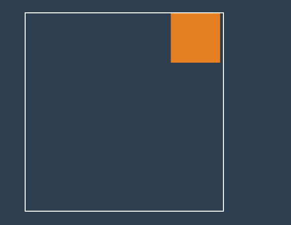
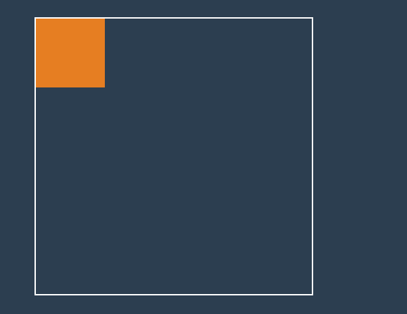
📗 下面使用 @keyframes 定义了动画叫 test 并配置了两个帧动作from/to ,然后在div元素中使用animation-name 引用了动画并使用animation-duration声明执行三秒。
@keyframes test {
    from {
        opacity: 0;
        transform: scale(.1);
    }
    to {
        opacity: 1;
        /* transform: scale(1); */
    }
}
2
3
4
5
6
7
8
9
10
animation-name: test;
animation-duration: 3s;
2
👾 动画命名不要使用CSS关键字如 none

<style>
    * {
        padding: 0;
        margin: 0;
    }

    body {
        background: #2c3e50;
        display: flex;
        flex-direction: column;
        justify-content: center;
        align-items: center;
        box-sizing: border-box;
        width: 100vw;
        height: 100vh;
        padding: 80px;
    }

    main {
        width: 400px;
        height: 400px;
    }

    div {
        width: 150px;
        height: 150px;
        background-color: #fff;
        border: solid 20px #ddd;
        animation-name: test;
        animation-duration: 3s;
    }

    @keyframes test {
        from {
            opacity: 0;
            transform: scale(.1);
        }

        to {
            opacity: 1;
        }
    }
</style>

<main>
    <div></div>
</main>
2
3
4
5
6
7
8
9
10
11
12
13
14
15
16
17
18
19
20
21
22
23
24
25
26
27
28
29
30
31
32
33
34
35
36
37
38
39
40
41
42
43
44
45
46
47
时间点
📗 帧动画需要定义在不同时间执行的动作,开始与结束可以使用 `form/to` 或 `0%/100%` 声明。
- 必须添加百分号,25%是正确写法
- 时间点没有顺序要求,即100%写在25%前也可以
- 未设置
0%与100%时将使用元素原始状态 📌
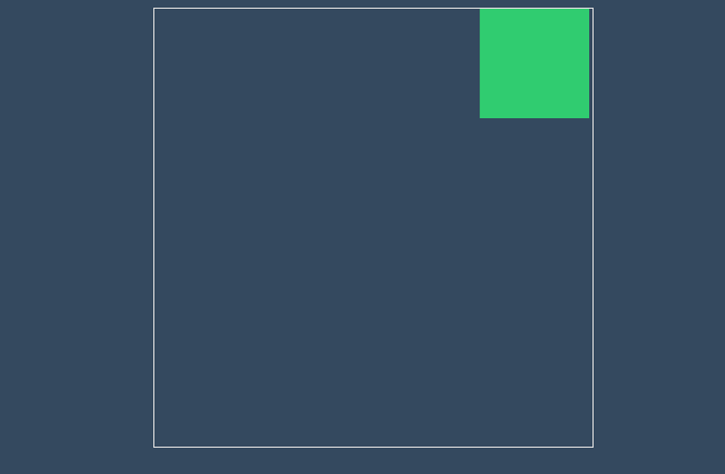
物体移动
下面定义不同时间点来让物体元素移动一圈,下例中可以不设置from/to 系统将定义为元素初始状态。
<style>
    * {
        padding: 0;
        margin: 0;
    }
    body {
        background: #2c3e50;
        display: flex;
        flex-direction: column;
        justify-content: center;
        align-items: center;
        box-sizing: border-box;
        width: 100vw;
        height: 100vh;
        padding: 80px;
    }
    main {
        width: 400px;
        height: 400px;
        border: solid 2px white;
    }
    div {
        width: 100px;
        height: 100px;
        background-color: #e67e22;
        animation-name: test;
        animation-duration: 3s;
    }
    @keyframes test {
        0% {}

        25% {
            transform: translateX(300%);
        }

        50% {
            transform: translate(300%, 300%);
        }

        75% {
            transform: translate(0, 300%);
        }

        to {}
    }
</style>

<main>
    <div></div>
</main>
2
3
4
5
6
7
8
9
10
11
12
13
14
15
16
17
18
19
20
21
22
23
24
25
26
27
28
29
30
31
32
33
34
35
36
37
38
39
40
41
42
43
44
45
46
47
48
49
50
同时声明
时间点可以动画样式一样时可以一起声明,下面将25%/75%背景一起声明。

@keyframes test {
    25% {
        transform: translateX(300%);
    }

    50% {
        transform: translate(300%, 300%);
    }

    75% {
        transform: translate(0, 300%);
    }

    25%,
    75% {
        background: #9b59b6;
        border-radius: 50%;
    }

    50%,
    100% {
        background: #e67e22;

    }
}
2
3
4
5
6
7
8
9
10
11
12
13
14
15
16
17
18
19
20
21
22
23
24
25
使用动画
`animation-name` 规则可以在元素身上同时使用多个动画。
- 使用多个动画时用逗号分隔
- 多个动画有相同属性时,后面动画的属性优先使用
基本使用
div {
    width: 100px;
    height: 100px;
    background-color: #e67e22;
    animation-name: translate, scale;
    animation-duration: 3s;
}

@keyframes translate {
    25% {
        transform: translateX(300%);
    }

    50% {
        transform: translate(300%, 300%);
    }

    75% {
        transform: translate(0, 300%);
    }

    25%,
    75% {
        background: #9b59b6;
    }

    50%,
    100% {
        background: #e67e22;
    }

}

@keyframes scale {
    from {
        border-radius: 0;
    }

    75% {
        border-radius: 50%;
    }

    to {
        border-radius: 0;
    }
}
2
3
4
5
6
7
8
9
10
11
12
13
14
15
16
17
18
19
20
21
22
23
24
25
26
27
28
29
30
31
32
33
34
35
36
37
38
39
40
41
42
43
44
45
46
动画时间
`animation-duration` 可以声明动画播放的时间,即把所有帧执行一遍所需要的时间。
- 可以使用m秒,ms毫秒时间单位
- 可为不同动画单独设置执行时间
- 如果动画数量大于时间数量,将重新从时间列表中计算
炫彩背景
下面实例声明三个动画,使用 animation-duration为每个动画设置不同执行的时间。
📌 当动画开始时,三个动画是同时开始执行的,duration规定了从开始到结束的总时间。

<style>
    main {
        background: #34495e;
        animation-name: scale, colors, rotate;
        animation-duration: 1s, 5s, 1s;
        animation-fill-mode: forwards;
    }

    @keyframes scale {
        from {
            width: 0;
            height: 0;
        }

        to {
            width: 100vw;
            height: 100vh;
        }
    }

    @keyframes colors {
        0% {
            background: #e67e22;
        }

        50% {
            background: #34495e;
        }

        100% {
            background: #16a085;
        }
    }

    @keyframes rotate {
        0% {
            transform: rotate(0deg);
        }

        50% {
            transform: rotate(-360deg);
        }

        100% {
            transform: rotate(360deg);
        }
    }
</style>

<body>
    <main></main>
</body>
2
3
4
5
6
7
8
9
10
11
12
13
14
15
16
17
18
19
20
21
22
23
24
25
26
27
28
29
30
31
32
33
34
35
36
37
38
39
40
41
42
43
44
45
46
47
48
49
50
51
52
属性重叠
📗 如果多个帧动画设置了相同的属性,不同浏览器的对待方式略有不同。比如 chrome/edge最新版本对动画的计算就有变化。
<!DOCTYPE html>
<html lang="en">

    <head>
        <meta charset="UTF-8" />
        <meta name="viewport" content="width=device-width, initial-scale=1.0" />
        <style>
            * {
                padding: 0;
                margin: 0;
            }

            body {
                width: 100vw;
                height: 100vh;
                background: #34495e;
                display: flex;
                justify-content: center;
                align-items: center;
            }

            main {
                width: 400px;
                height: 400px;
                border: solid 1px #ddd;
            }

            div {
                width: 100px;
                height: 100px;
                background: #f1c40f;
                animation-name: translate, background;
                animation-duration: 4s, 4s;
            }

            @keyframes translate {
                25% {
                    transform: translateX(300px);
                }

                50% {
                    transform: translate(300px, 300px);
                }

                75% {
                    transform: translateY(300px);
                }
            }

            @keyframes background {
                25% {
                    background: #2ecc71;
                    transform: translateX(300px);
                }

                50% {
                    background: #e67e22;
                }

                75% {
                    background: #9b59b6;
                }
            }
        </style>
    </head>

    <body>
        <main>
            <div></div>
        </main>
    </body>

</html>
2
3
4
5
6
7
8
9
10
11
12
13
14
15
16
17
18
19
20
21
22
23
24
25
26
27
28
29
30
31
32
33
34
35
36
37
38
39
40
41
42
43
44
45
46
47
48
49
50
51
52
53
54
55
56
57
58
59
60
61
62
63
64
65
66
67
68
69
70
71
72
73
👾 上面的示例在早期chrome与safari浏览器效果是相同的:后面的background动画优先级高,4秒时长的动画都用background动画来控制translate属性。
在最新版本的chrome/edge中执行过程将两个帧动画结合处理
- 前25%帧使用background的动画
- 25%帧后综合使用background与translate动画
✅ 所以建议尽量不要在两个动画中控制相同的属性
动画属性
📗 不是所有css属性都有过渡效果,查看支持动画的CSS属性 (opens new window)在新窗口打开,一般来讲有中间值的属性都可以设置动画如宽度、透明度等。
属性体验
📌 下例中的边框变化没有中间值,所以是瞬间改变也没有产生动画效果。

<head>
    <style>
        * {
            padding: 0;
            margin: 0;
        }

        h2 {
            color: #f39c12;
        }

        body {
            width: 100vw;
            height: 100vh;
            background: #34495e;
            display: flex;
            flex-direction: column;
            justify-content: center;
            align-items: center;
        }

        main {
            width: 100px;
            height: 100px;
            background: white;
            animation-name: gg;
            animation-duration: 2s;
        }

        @keyframes gg {
            0% {
                background: #9b59b6;
                border: solid 10px #000;
            }

            100% {
                width: 200px;
                height: 200px;
                background: #e74c3c;
                border: double 10px #000;
            }
        }
    </style>
</head>

<body>
    <main></main>
    <h2>Jerry Chen</h2>
</body>
2
3
4
5
6
7
8
9
10
11
12
13
14
15
16
17
18
19
20
21
22
23
24
25
26
27
28
29
30
31
32
33
34
35
36
37
38
39
40
41
42
43
44
45
46
47
48
49
中间值
下面是例子尺寸没有产生动画,因为0%帧设置的尺寸单位与 100% 设置的尺寸没有中间值,解析器没有办法计算,最终效果如下:

<head>
    <style>
        * {
            padding: 0;
            margin: 0;
        }

        h2 {
            color: #f39c12;
        }

        body {
            width: 100vw;
            height: 100vh;
            background: #34495e;
            display: flex;
            flex-direction: column;
            justify-content: center;
            align-items: center;
        }

        main {
            width: 100px;
            height: 100px;
            background: white;
            animation-name: jj;
            animation-duration: 2s;
        }

        @keyframes jj {
            0% {
                width: auto;
                height: auto;
                background: #9b59b6;
            }

            100% {
                width: 200px;
                height: 200px;
                background: #e74c3c;
            }
        }
    </style>
</head>

<body>
    <main></main>
    <h2>Jerry Chen</h2>
</body>
2
3
4
5
6
7
8
9
10
11
12
13
14
15
16
17
18
19
20
21
22
23
24
25
26
27
28
29
30
31
32
33
34
35
36
37
38
39
40
41
42
43
44
45
46
47
48
49
正确效果应该是这样

@keyframes jj {
    0% {
        width: auto;
        height: auto;
        background: #9b59b6;
    }

    50% {
        width: 100px;
        height: 100px;
        background: cornsilk;
    }

    100% {
        width: 200px;
        height: 200px;
        background: #e74c3c;
    }
}
2
3
4
5
6
7
8
9
10
11
12
13
14
15
16
17
18
19
重复动画
`animation-iteration-count` 规则设置动画重复执行次数,设置值为 `infinite` 表示无限循环执行。
- 可同时设置元素的多个动画重复,使用逗号分隔
- 如果动画数量大于重复数量定义,后面的动画将重新计算重复
心动感觉
使用循环动画绘制心动效果

<style>
    .heart {
        width: 200px;
        height: 200px;
        background: #e74c3c;
        transform: rotate(45deg);
        position: relative;
        animation-name: heart;
        animation-duration: 1s;
        animation-iteration-count: 100;
    }

    .heart::before {
        content: '';
        width: 200px;
        height: 200px;
        border-radius: 50%;
        background: #e74c3c;
        position: absolute;
        transform: translate(-50%, 0px);
    }

    .heart::after {
        content: '';
        width: 200px;
        height: 200px;
        border-radius: 50%;
        background: #e74c3c;
        position: absolute;
        transform: translate(0%, -50%);
    }

    @keyframes heart {
        from {
            transform: scale(.3) rotate(45deg);
        }

        to {
            transform: scale(1) rotate(45deg);
        }
    }
</style>

<main>
	<div class="heart"></div>
</main>
2
3
4
5
6
7
8
9
10
11
12
13
14
15
16
17
18
19
20
21
22
23
24
25
26
27
28
29
30
31
32
33
34
35
36
37
38
39
40
41
42
43
44
45
46
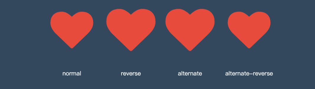
动画方向 💡
使用 animation-direction 控制动画运行的方向。
| 选项 | 说明 |
|---|---|
| normal | 从0%到100%运行动画 |
| reverse | 从100%到0%运行动画 |
| alternate | 先从0%到100%,然后从100%到0% |
| alternate-reverse | 先从100%到0%,然后从0%到100% |
效果比较
<head>
    <link rel="stylesheet" href="https://maxcdn.bootstrapcdn.com/font-awesome/4.7.0/css/font-awesome.min.css">
    <style>
        * {
            padding: 0;
            margin: 0;
        }

        h2 {
            color: #f39c12;
        }

        body {
            width: 100vw;
            height: 100vh;
            background: #34495e;
            display: flex;
            flex-direction: column;
            justify-content: center;
            align-items: center;
        }

        ul {
            width: 400px;
            height: 100px;
            display: flex;
        }

        li {
            list-style: none;
            text-align: center;
            display: flex;
            flex-direction: column;
            flex: 1;
            justify-content: space-between;
        }

        li span {
            font-size: 10px;
            color: #ecf0f1;
        }

        i.fa {
            font-size: 30px;
            margin: 5px;
            color: #e74c3c;
            animation-name: hd;
            animation-duration: 2s;
            animation-iteration-count: infinite;
        }

        li:nth-child(1)>i.fa {
            animation-direction: normal;
        }

        li:nth-child(2)>i.fa {
            animation-direction: reverse;
        }

        li:nth-child(3)>i.fa {
            animation-direction: alternate;
        }

        li:nth-child(4)>i.fa {
            animation-direction: alternate-reverse;
        }

        @keyframes hd {
            from {}

            to {
                opacity: 1;
                transform: scale(3);
            }
        }
    </style>
</head>

<body>
    <ul>
        <li>
            <i class="fa fa-heart" aria-hidden="true"></i>
            <span>normal</span>
        </li>
        <li>
            <i class="fa fa-heart" aria-hidden="true"></i>
            <span>reverse</span>
        </li>
        <li>
            <i class="fa fa-heart" aria-hidden="true"></i>
            <span>alternate</span>
        </li>
        <li>
            <i class="fa fa-heart" aria-hidden="true"></i>
            <span>alternate-reverse</span>
        </li>
    </ul>
</body>
2
3
4
5
6
7
8
9
10
11
12
13
14
15
16
17
18
19
20
21
22
23
24
25
26
27
28
29
30
31
32
33
34
35
36
37
38
39
40
41
42
43
44
45
46
47
48
49
50
51
52
53
54
55
56
57
58
59
60
61
62
63
64
65
66
67
68
69
70
71
72
73
74
75
76
77
78
79
80
81
82
83
84
85
86
87
88
89
90
91
92
93
94
95
96
97
98
reverse
根据上面的心动例子改变方向为100%~0%

alternate
根据上面的心动例子改变方向为0%~100%然后100%~0%

animation-direction: alternate-reverse;
alternate-reverse
通过使用合适的运动方向 alternate-reverse 制作跳动的小球
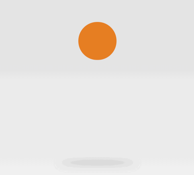
<style>
    main {
        display: flex;
        margin-top: 400px;
        flex-direction: column;
        justify-content: center;
        align-items: center;
    }

    div {
        width: 200px;
        height: 200px;
        border-radius: 50%;
        background: #e67e22;
        animation-name: ball;
        animation-duration: 1s;
        animation-iteration-count: infinite;
        animation-direction: alternate-reverse;
    }

    @keyframes ball {
        0% {}

        100% {
            transform: translateY(-300px);
        }
    }

    section {
        width: 400px;
        height: 10px;
        border-radius: 50%;
        animation-name: shadow;
        animation-duration: 1s;
        animation-iteration-count: infinite;
        animation-direction: alternate;
    }

    @keyframes shadow {
        from {
            background: #000;
            transform: scale(1);
            filter: blur(35px);
        }

        to {
            background: #aaa;
            filter: blur(10px);
        }
    }
</style>

<main>
    <div></div>
    <section></section>
</main>
2
3
4
5
6
7
8
9
10
11
12
13
14
15
16
17
18
19
20
21
22
23
24
25
26
27
28
29
30
31
32
33
34
35
36
37
38
39
40
41
42
43
44
45
46
47
48
49
50
51
52
53
54
55
56
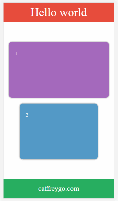
延迟动画
使用 animation-delay 规则定义动画等待多长时间后执行。
微场景
<style>
    * {
        margin: 0;
        padding: 0;
    }

    body {
        width: 100vw;
        height: 100vh;
        display: flex;
        flex-direction: column;
        justify-content: space-between;
    }

    header {
        width: 100vw;
        height: 10vh;
        font-size: 2.5em;
        color: white;
        background: #e74c3c;
        text-align: center;
        line-height: 10vh;
        animation-name: jr-translate;
        animation-duration: 500ms;
    }

    main {
        flex: 1;
        width: 100vw;
        height: 300px;
        left: 0;
        bottom: 0;
        background: url("5.jpg") no-repeat right bottom;
        background-size: cover;
        display: flex;
        flex-direction: column;
        justify-content: center;
        align-items: center;
        transform: translateX(-100vw);
        animation-name: jr-rotate;
        animation-duration: 1s;
        animation-fill-mode: forwards;
    }

    main>* {
        opacity: .8;
        font-size: 1.2em;
        line-height: 2em;
        color: #f3f3f3;
        padding: 20px;
        border-radius: 10px;
        box-shadow: 0 0 5px rgba(0, 0, 0, .6);
    }

    main>.lesson {
        width: 80vw;
        height: 40vw;
        background: #8e44ad;
        transform: translate(-100vw, -100vh);
        animation-name: jr-rotate;
        animation-duration: 1s;
        animation-delay: 1s;
        animation-fill-mode: forwards;
    }

    main>.video {
        margin-top: 20px;
        width: 60vw;
        height: 40vw;
        background: #2980b9;
        animation-name: jr-translate;
        animation-duration: 1s;
        animation-delay: 2s;
        transform: translate(-100vw, -100vh);
        animation-fill-mode: forwards;
    }

    footer {
        width: 100vw;
        height: 10vh;
        font-size: 1.5em;
        color: white;
        background: #27ae60;
        text-align: center;
        line-height: 10vh;
        animation-name: jr-skew;
        animation-duration: 500ms;
        animation-delay: 3s;
        transform: translateX(-100vw);
        animation-fill-mode: forwards;
    }

    @keyframes jr-translate {
        from {
            transform: translate(-100vw, -100vh);
        }

        to {
            transform: translateY(0);
        }
    }

    @keyframes jr-rotate {
        from {
            transform: translate(-100%, -100%);
        }

        to {
            transform: translateX(0) rotate(360deg);
        }
    }

    @keyframes jr-skew {
        from {
            transform: translateX(-100%) skew(-45deg);
        }

        to {
            transform: skewX(0deg);
        }
    }
</style>
<header>
    Hello world
</header>
<main>
    <div class="lesson">
        1
    </div>
    <div class="video jr-translate">
        2
    </div>
</main>
<footer>
    caffreygo.com
</footer>
2
3
4
5
6
7
8
9
10
11
12
13
14
15
16
17
18
19
20
21
22
23
24
25
26
27
28
29
30
31
32
33
34
35
36
37
38
39
40
41
42
43
44
45
46
47
48
49
50
51
52
53
54
55
56
57
58
59
60
61
62
63
64
65
66
67
68
69
70
71
72
73
74
75
76
77
78
79
80
81
82
83
84
85
86
87
88
89
90
91
92
93
94
95
96
97
98
99
100
101
102
103
104
105
106
107
108
109
110
111
112
113
114
115
116
117
118
119
120
121
122
123
124
125
126
127
128
129
130
131
132
133
134
135
136
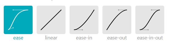
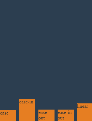
动画速率
系统属性
animation-timing-function
| 值 | 描述 |
|---|---|
| linear | 规定以相同速度开始至结束的过渡效果(等于 cubic-bezier(0,0,1,1))。 |
| ease | 开始慢,然后快,慢下来,结束时非常慢(cubic-bezier(0.25,0.1,0.25,1)) |
| ease-in | 开始慢,结束快(等于 cubic-bezier(0.42,0,1,1)) |
| ease-out | 开始快,结束慢(等于 cubic-bezier(0,0,0.58,1)) |
| ease-in-out | 中间快,两边慢(等于 cubic-bezier(0.42,0,0.58,1)) |
| cubic-bezier(n,n,n,n) | 在 cubic-bezier 函数中定义自己的值 |
可以在帧中单独定义,将影响当前帧的速率
贝塞尔曲线
📗 需要设置四个值 cubic-bezier(<x1>, <y1>, <x2>, <y2>),来控制曲线速度,可在 https://cubic-bezier.com (opens new window)在新窗口打开网站在线体验效果。
体验效果
<head>
    <meta charset="UTF-8">
    <meta name="viewport" content="width=device-width, initial-scale=1.0">
    <style>
        * {
            padding: 0;
            margin: 0;
        }

        body {
            width: 100vw;
            height: 100vh;
            background: #2c3e50;
            display: grid;
            grid-template-columns: 1fr;
        }

        ul {
            box-sizing: border-box;
            list-style: none;
            display: grid;
            grid-template-columns: repeat(5, 1fr);
            gap: 10px;
        }

        li {
            box-sizing: border-box;
            background: #e67e22;
            animation-name: move;
            animation-duration: 3s;
            animation-iteration-count: infinite;
            color: #333333;
        }

        li:nth-child(1) {
            animation-timing-function: ease;
        }

        li:nth-child(2) {
            animation-timing-function: ease-in;
        }

        li:nth-child(3) {
            animation-timing-function: ease-out;
        }

        li:nth-child(4) {
            animation-timing-function: ease-in-out;
        }

        li:nth-child(5) {
            animation-timing-function: linear;
        }

        @keyframes move {
            to {
                transform: translateY(90vh);
            }
        }
    </style>
</head>

<body>
    <ul>
        <li>ease</li>
        <li>ease-in</li>
        <li>ease-out</li>
        <li>ease-in-out</li>
        <li>linear</li>
    </ul>
</body>
2
3
4
5
6
7
8
9
10
11
12
13
14
15
16
17
18
19
20
21
22
23
24
25
26
27
28
29
30
31
32
33
34
35
36
37
38
39
40
41
42
43
44
45
46
47
48
49
50
51
52
53
54
55
56
57
58
59
60
61
62
63
64
65
66
67
68
69
70
71
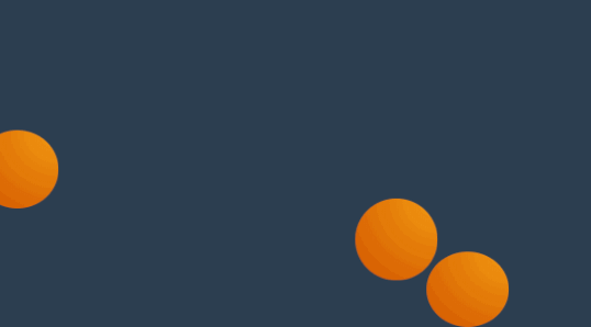
弹跳小球 💡

<head>
    <style>
        body {
            width: 100vw;
            height: 100vh;
            display: flex;
            flex-direction: column;
            justify-content: flex-end;
            align-items: flex-start;
            background: #2c3e50;
        }

        div {
            position: absolute;
            width: 100px;
            height: 100px;
            left: 30%;
            top: 0px;
            transform: translate(0vw, 0);
            background: radial-gradient(at right top, #f39c12, #d35400);
            border-radius: 50%;
            animation-name: jump;
            animation-duration: 2s;
            animation-iteration-count: infinite;
            animation-timing-function: ease-in;
        }

        div:nth-child(2) {
            animation-delay: .2s;
            left: 60%;
        }

        @keyframes jump {
            0% {
                transform: translateY(0);
                animation-timing-function: ease-in;
            }

            30% {
                transform: translateY(10vh);
                animation-timing-function: ease-in;
            }

            60% {
                transform: translateY(40vh);
                animation-timing-function: ease-in;
            }

            80% {
                transform: translateY(60vh);
                animation-timing-function: ease-in;
            }

            95% {
                transform: translateY(75vh);
                animation-timing-function: ease-in;
            }

            15%,
            45%,
            70%,
            85%,
            100% {
                transform: translateY(80vh);
                animation-timing-function: ease-out;
            }
        }
    </style>
</head>

<body>
    <div></div>
    <div></div>
</body>
2
3
4
5
6
7
8
9
10
11
12
13
14
15
16
17
18
19
20
21
22
23
24
25
26
27
28
29
30
31
32
33
34
35
36
37
38
39
40
41
42
43
44
45
46
47
48
49
50
51
52
53
54
55
56
57
58
59
60
61
62
63
64
65
66
67
68
69
70
71
72
73
74
魔术小球
<style>
    body {
        width: 100vw;
        height: 100vh;
        display: flex;
        flex-direction: column;
        justify-content: flex-end;
        align-items: flex-start;
        background: #2c3e50;
    }

    div {
        position: absolute;
        width: 100px;
        height: 100px;
        transform: translate(-20vw, -300%);
        background: radial-gradient(at right top, #f39c12, #d35400);
        border-radius: 50%;
        animation-name: jump;
        animation-duration: 1.5s;
        animation-iteration-count: infinite;
        animation-timing-function: ease-in;
    }

    div:nth-child(2) {
        animation-delay: .2s;
    }

    div:nth-child(3) {
        animation-delay: 1s;
    }

    @keyframes jump {
        0% {
            transform: translate(-20vw, -300%);
        }

        10% {
            transform: scaleY(.9) translate(15vw, 0%);
        }

        20% {
            transform: translate(20vw, -200%);
        }

        30% {
            transform: scaleY(.9) translate(30vw, 0%);
        }

        40% {
            transform: translate(40vw, -120%);
        }

        50% {
            transform: scaleY(.9) translate(50vw, 0%);
        }

        60% {
            transform: translate(60vw, -70%);
        }

        70% {
            transform: scaleY(.9) translate(70vw, 0%);
        }

        80% {
            transform: translate(80vw, -50%);
        }

        90% {
            transform: scaleY(.9) translate(90vw, 0%);
        }

        95% {
            transform: translate(95vw, -30%);
        }

        100% {
            transform: scaleY(.9) translate(100vw, 0%);
        }
    }

    @keyframes move {
        0% {
            /* transform: translateY(-400%); */
        }

        100% {
            /* right: 100px; */
        }
    }
</style>

<body>
    <div></div>
    <div></div>
    <div></div>
</body>
2
3
4
5
6
7
8
9
10
11
12
13
14
15
16
17
18
19
20
21
22
23
24
25
26
27
28
29
30
31
32
33
34
35
36
37
38
39
40
41
42
43
44
45
46
47
48
49
50
51
52
53
54
55
56
57
58
59
60
61
62
63
64
65
66
67
68
69
70
71
72
73
74
75
76
77
78
79
80
81
82
83
84
85
86
87
88
89
90
91
92
93
94
95
96
97
98
按钮提交

<head>
    <style>
        body {
            width: 100vw;
            height: 100vh;
            display: flex;
            justify-content: center;
            align-items: center;
            background: #34495e;
        }

        button {
            padding: 10px 50px;
            outline: none;
            background: #e67e22;
            font-size: 2em;
            border: solid 5px white;
            color: white;
        }

        button::after {
            content: '';
            display: inline-block;
            height: 3px;
            width: 3px;
            box-shadow: 3px 0 currentColor, 9px 0 currentColor, 15px 0 currentColor;
            animation-name: point;
            animation-duration: 1s;
            animation-iteration-count: infinite;
            animation-timing-function: linear;
            margin-left: 5px;
        }

        @keyframes point {
            from {
                box-shadow: none;
            }

            30% {
                box-shadow: 3px 0 currentColor;
            }

            60% {
                box-shadow: 3px 0 currentColor, 9px 0 currentColor;
            }

            90% {
                box-shadow: 3px 0 currentColor, 9px 0 currentColor, 15px 0 currentColor;
            }
        }
    </style>
</head>

<body>
    <button>
        <i class="fa fa-code" aria-hidden="true"></i>
        提交
    </button>
</body>
2
3
4
5
6
7
8
9
10
11
12
13
14
15
16
17
18
19
20
21
22
23
24
25
26
27
28
29
30
31
32
33
34
35
36
37
38
39
40
41
42
43
44
45
46
47
48
49
50
51
52
53
54
55
56
57
58
59
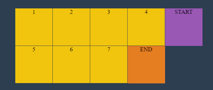
步进速度
过渡使用阶梯化呈现,有点像现实生活中的机械舞,下面是把过渡分五步完成。
| 选项 | 说明 |
|---|---|
| steps(n,start) | 设置n个时间点,第一时间点变化状态 |
| steps(n,end) | 设置n个时间点,第一时间点初始状态 |
| step-start | 等于steps(1,start),可以理解为从下一步开始 |
| step-end | 等于steps(1,end),可以理解为从当前步开始 |
steps
📗 steps(n,start) 可以简单理解为从第二个开始,steps(n,end) 从第一个开始。
<head>
    <meta charset="UTF-8">
    <meta name="viewport" content="width=device-width, initial-scale=1.0">
    <style>
        * {
            padding: 0;
            margin: 0;
        }

        body {
            width: 100vw;
            height: 100vh;
            background: #2c3e50;
            display: grid;
            /* justify-content: center;
            align-content: center; */
        }

        main {
            justify-self: center;
            align-self: center;
            width: 400px;
            height: 200px;
            display: grid;
            grid-template: repeat(2, 1fr)/repeat(4, 1fr);
        }

        div {
            background: #f1c40f;
            text-align: center;
            position: relative;
            border-right: solid 1px #2c3e50;
            border-bottom: solid 1px #2c3e50;
            box-sizing: border-box;
        }

        div:nth-child(5)::before {
            content: 'END';
            position: absolute;
            width: 100px;
            height: 100px;
            background: #e67e22;
            left: 0;
            animation-name: move;
            animation-duration: 2s;
            z-index: 2;
            animation-timing-function: steps(4, end);
            animation-iteration-count: infinite;
        }

        div:nth-child(1)::after {
            content: 'START';
            position: absolute;
            width: 100px;
            height: 100px;
            background: #9b59b6;
            animation-name: move;
            animation-duration: 2s;
            animation-timing-function: steps(4, start);
            animation-iteration-count: infinite;
            z-index: 2;
            left: 0;
            top: 0;
        }

        @keyframes move {
            to {
                transform: translateX(400px);
            }
        }
    </style>
</head>

<body>
    <main>
        <div>1</div>
        <div>2</div>
        <div>3</div>
        <div>4</div>
        <div>5</div>
        <div>6</div>
        <div>7</div>
        <div>8</div>
    </main>
</body>
2
3
4
5
6
7
8
9
10
11
12
13
14
15
16
17
18
19
20
21
22
23
24
25
26
27
28
29
30
31
32
33
34
35
36
37
38
39
40
41
42
43
44
45
46
47
48
49
50
51
52
53
54
55
56
57
58
59
60
61
62
63
64
65
66
67
68
69
70
71
72
73
74
75
76
77
78
79
80
81
82
83
84
85
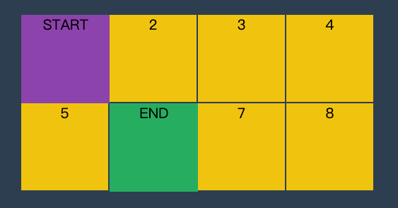
step-start
📗 step-start 效果等于 steps(1,start) ,step-end 效果等同于 steps(1,end)。
<head>
    <meta charset="UTF-8">
    <meta name="viewport" content="width=device-width, initial-scale=1.0">
    <style>
        * {
            padding: 0;
            margin: 0;
        }

        body {
            width: 100vw;
            height: 100vh;
            background: #2c3e50;
            display: grid;
        }

        main {
            align-self: center;
            justify-self: center;
            width: 400px;
            height: 200px;
            display: grid;
            grid-template: repeat(2, 1fr)/repeat(4, 1fr);
        }

        div {
            text-align: center;
            background: #f1c40f;
            border: solid 1px #2c3e50;
            box-sizing: border-box;
            position: relative;
        }

        div:nth-child(1)::before,
        div:nth-child(5)::before {
            animation-name: hd;
            animation-iteration-count: infinite;
            animation-duration: .5s;
            z-index: 2;
        }

        div:nth-child(1)::before {
            content: 'START';
            width: 100px;
            height: 100px;
            background: #8e44ad;
            position: absolute;
            left: 0;
            top: 0;
            animation-timing-function: step-start;
        }

        div:nth-child(5)::before {
            content: 'END';
            width: 100px;
            height: 100px;
            background: #27ae60;
            position: absolute;
            left: 0;
            top: 0;
            animation-timing-function: step-end;
        }

        @keyframes hd {
            50% {
                transform: translateX(100px);
            }

            to {
                transform: translateX(0px);
            }
        }
    </style>
</head>

<body>
    <main>
        <div>1</div>
        <div>2</div>
        <div>3</div>
        <div>4</div>
        <div>5</div>
        <div>6</div>
        <div>7</div>
        <div>8</div>
    </main>
</body>
2
3
4
5
6
7
8
9
10
11
12
13
14
15
16
17
18
19
20
21
22
23
24
25
26
27
28
29
30
31
32
33
34
35
36
37
38
39
40
41
42
43
44
45
46
47
48
49
50
51
52
53
54
55
56
57
58
59
60
61
62
63
64
65
66
67
68
69
70
71
72
73
74
75
76
77
78
79
80
81
82
83
84
85
86
87
播放状态
📗 使用 animation-play-state 可以控制动画的暂停与运行。
| 选项 | 说明 |
|---|---|
| paused | 暂停 |
| running | 运行 |
幻灯片
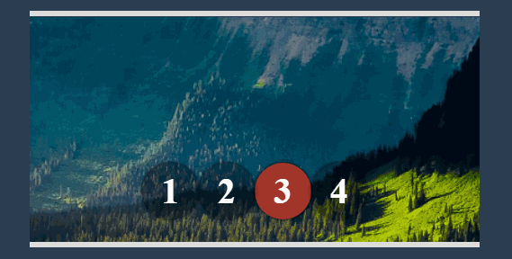
下面是使用无JS脚本参与的图片轮换效果,图片切换使用steps 步进与animation-play-state播放状态技术。
<head>
    <link rel="stylesheet" href="https://maxcdn.bootstrapcdn.com/font-awesome/4.7.0/css/font-awesome.min.css">
    <script src='https://code.jquery.com/jquery-3.3.1.slim.min.js'></script>
    <style>
        * {
            padding: 0;
            margin: 0;
        }

        body {
            width: 100vw;
            height: 100vh;
            display: flex;
            justify-content: center;
            align-items: center;
            background: #2c3e50;
        }

        main {
            width: 400px;
            border: solid 5px #ddd;
            border-width: 5px 0 5px 0;
            overflow: hidden;
            position: relative;
        }

        main:hover section {
            animation-play-state: paused;
        }

        main:hover ul::before {
            animation-play-state: paused;
        }

        section {
            width: 1600px;
            height: 200px;
            display: flex;
            flex-direction: row;
            animation-name: slide;
            animation-duration: 4s;
            animation-iteration-count: infinite;
            animation-timing-function: steps(4, end);
        }

        section div {
            width: 400px;
            height: 200px;
            overflow: hidden;
        }

        section div img {
            width: 100%;
        }

        ul {
            width: 200px;
            position: absolute;
            list-style: none;
            display: flex;
            justify-content: center;
            align-items: center;
            z-index: 3;
            bottom: 20px;
            left: 50%;
            transform: translateX(-50%);
        }

        ul li {
            font-size: 2em;
            font-weight: bold;
            color: white;
            width: 50px;
            height: 50px;
            border-radius: 50%;
            border: solid 3px transparent;
            box-sizing: border-box;
            display: flex;
            justify-content: center;
            align-items: center;
            z-index: 2;
            background: rgba(0, 0, 0, .3);
            box-shadow: 0 0 3px rgba(0, 0, 0, 1);
        }

        ul::before {
            content: '';
            width: 50px;
            height: 50px;
            border-radius: 50%;
            position: absolute;
            background: #e74c3c;
            left: 0;
            animation-name: num;
            animation-duration: 4s;
            animation-iteration-count: infinite;
            animation-timing-function: steps(4, end);
            z-index: 1;
        }

        @keyframes slide {
            from {
                transform: translateX(0px);
            }

            to {
                transform: translateX(-100%);
            }
        }

        @keyframes num {
            100% {
                transform: translateX(200px);
            }
        }
    </style>
</head>

<body>
    <main>
        <section>
            <div>
                <img src="1.jpg" alt="">
            </div>
            <div>
                <img src="2.jpg" alt="">
            </div>
            <div>
                <img src="3.jpg" alt="">
            </div>
            <div>
                <img src="4.jpg" alt="">
            </div>
        </section>
        <ul>
            <li>1</li>
            <li>2</li>
            <li>3</li>
            <li>4</li>
        </ul>
    </main>
</body>
2
3
4
5
6
7
8
9
10
11
12
13
14
15
16
17
18
19
20
21
22
23
24
25
26
27
28
29
30
31
32
33
34
35
36
37
38
39
40
41
42
43
44
45
46
47
48
49
50
51
52
53
54
55
56
57
58
59
60
61
62
63
64
65
66
67
68
69
70
71
72
73
74
75
76
77
78
79
80
81
82
83
84
85
86
87
88
89
90
91
92
93
94
95
96
97
98
99
100
101
102
103
104
105
106
107
108
109
110
111
112
113
114
115
116
117
118
119
120
121
122
123
124
125
126
127
128
129
130
131
132
133
134
135
136
137
138
139
140
141
142
填充模式
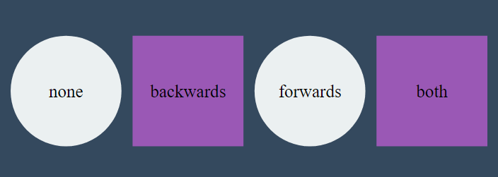
📗 animation-fill-mode 用于定义动画播放结束后的处理模式,是回到原来状态还是停止在动画结束状态。
| 选项 | 说明 |
|---|---|
| none | 需要等延迟结束,起始帧属性才应用 |
| backwards | 动画效果在起始帧,不等延迟结束 |
| forwards | 结束后停留动画的最后一帧 |
| both | 包含backwards与forwards规则,即动画效果在起始帧,不等延迟结束,并且在结束后停止在最后一帧 |
效果对比
<head>
    <style>
        * {
            padding: 0;
            margin: 0;
        }

        body {
            width: 100vw;
            height: 100vh;
            background: #34495e;
            display: flex;
            flex-direction: column;
            justify-content: center;
            align-items: center;
        }

        ul {
            display: flex;
            justify-content: center;
            align-items: center;
        }

        li {
            list-style: none;
            width: 200px;
            height: 200px;
            background: #ecf0f1;
            border-radius: 50%;
            animation-name: hd;
            animation-delay: 2s;
            animation-duration: 2s;
            text-align: center;
            font-size: 2em;
            line-height: 200px;
            margin: 10px;
        }

        li:nth-child(1) {
            animation-fill-mode: none;
        }

        li:nth-child(2) {
            animation-fill-mode: backwards;
        }

        li:nth-child(3) {
            animation-fill-mode: forwards;
        }

        li:nth-child(4) {
            animation-fill-mode: both;
        }

        @keyframes hd {
            0% {
                border-radius: 0;
                background: #9b59b6;
            }

            100% {
                border-radius: 50%;
                background: #e74c3c;
            }
        }
    </style>
</head>

<body>
    <ul>
        <li>none</li>
        <li>backwards</li>
        <li>forwards</li>
        <li>both</li>
    </ul>
</body>
2
3
4
5
6
7
8
9
10
11
12
13
14
15
16
17
18
19
20
21
22
23
24
25
26
27
28
29
30
31
32
33
34
35
36
37
38
39
40
41
42
43
44
45
46
47
48
49
50
51
52
53
54
55
56
57
58
59
60
61
62
63
64
65
66
67
68
69
70
71
72
73
74
75
76
组合定义
📗 和CSS中的其他属性一样,可以使用animation组合定义帧动画。animation 属性是一个简写属性,用于设置六个动画属性:
- animation-name
- animation-duration
- animation-timing-function
- animation-delay
- animation-iteration-count
- animation-direction
必须存在
animation-duration属性,否则过渡时间为0没有动画效果。