弹性布局
📗 Flex 是 Flexible Box 的缩写,意为"弹性布局",可以轻松的控制元素排列、对齐和顺序的控制。
现在的终端类型非常多,使用弹性盒模型可以让元素在不同尺寸终端控制尺寸。
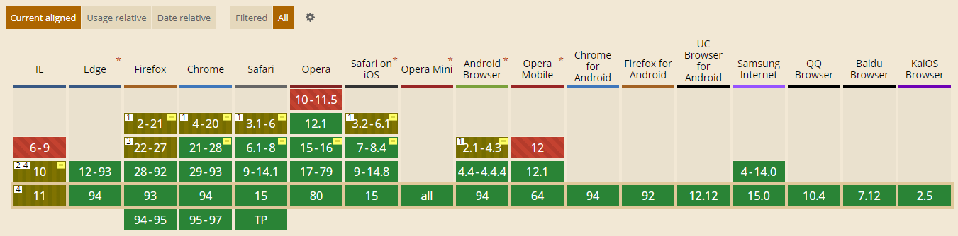
兼容性
下面是FLEX系统兼容性数据,在 https://caniuse.com/ (opens new window)在新窗口打开网站查看,绝大多数设备尤其是移动端都很好的支持FLEX,所以可以放心使用。
弹性盒子
声明定义
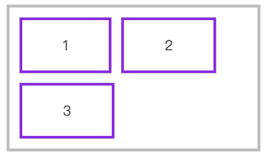
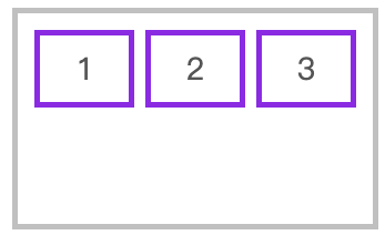
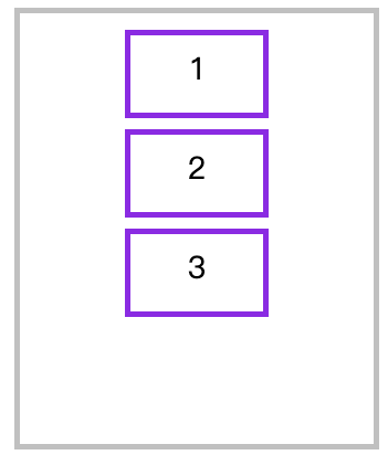
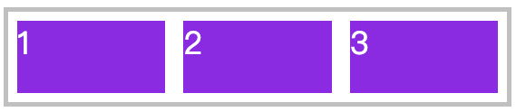
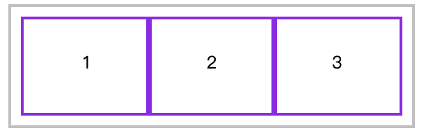
📗 容器盒子里面包含着容器元素,使用 display:flex 或 display:inline-flex 声明为弹性盒子。
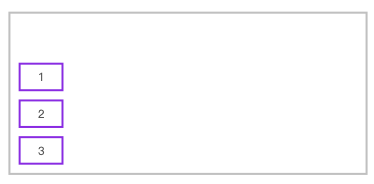
声明块级弹性盒子
<style>
  * {
    padding: 0;
    margin: 0;
  }
  article {
    height: 150px;
    margin-left: 100px;
    margin-top: 100px;
    outline: solid 5px silver;
    display: flex;
    padding: 20px;
  }
  article div {
    outline: solid 5px blueviolet;
    text-align: center;
    font-size: 28px;
    line-height: 5em;
    width: 300px;
  }
</style>

<article>
  <div>1</div>
	<div>2</div>
	<div>3</div>
</article>
2
3
4
5
6
7
8
9
10
11
12
13
14
15
16
17
18
19
20
21
22
23
24
25
26
27
声明内联级弹性盒子
article {
    display: inline-flex
}
2
3
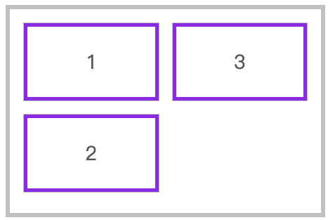
flex-direction
📗 用于控制盒子元素排列的方向。
| 值 | 描述 |
|---|---|
| row | 从左到右水平排列元素(默认值) |
| row-reverse | 从右向左排列元素 |
| column | 从上到下垂直排列元素 |
| column-reverse | 从下到上垂直排列元素 |
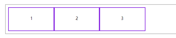
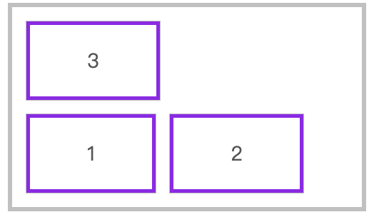
row-reverse
<style>
    * {
        padding: 0;
        margin: 0;
    }
    body {
        margin: 100px;
        font-size: 14px;
        color: #555;
    }
    article {
        width: 500px;
        border: solid 5px silver;
        display: flex;
        box-sizing: border-box;
        padding: 10px;
        flex-direction: row-reverse;
    }
    article * {
        border: solid 5px blueviolet;
        padding: 10px;
        margin: 10px;
    }
</style>

<article>
    <h4>A</h4>
    <span>B</span>
    <p>C</p>
</article>
2
3
4
5
6
7
8
9
10
11
12
13
14
15
16
17
18
19
20
21
22
23
24
25
26
27
28
29
30
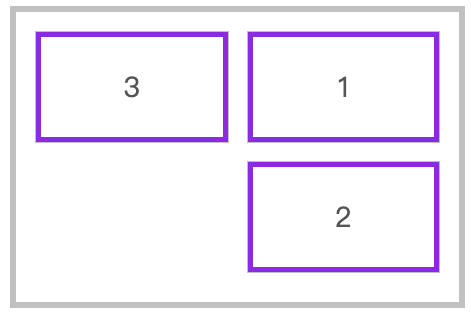
column-reverse
article {
    flex-direction: column-reverse;
}
2
3
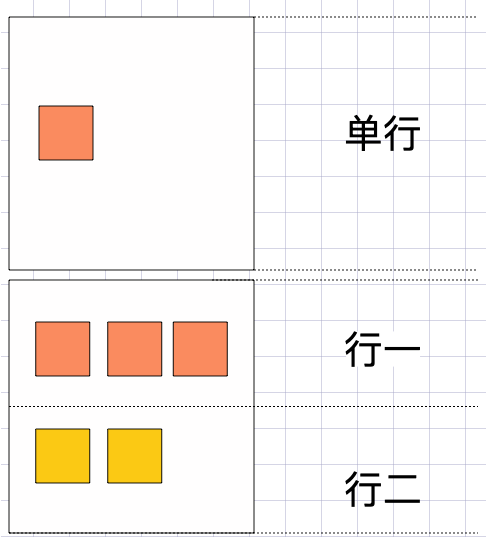
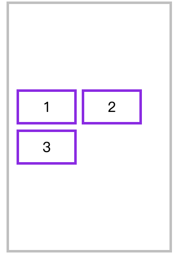
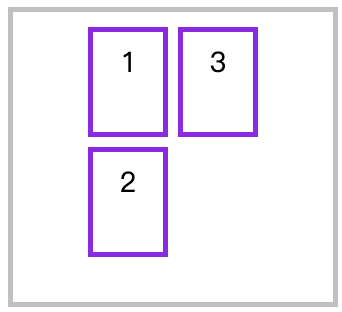
flex-wrap
📗 flex-wrap 属性规定flex容器是单行或者多行,同时横轴的方向决定了新行堆叠的方向。
| 选项 | 说明 |
|---|---|
| nowrap | 元素不拆行或不拆列(默认值) |
| wrap | 容器元素在必要的时候拆行或拆列。 |
| wrap-reverse | 容器元素在必要的时候拆行或拆列,但是以相反的顺序 |
行元素换行
<style>
	* {
    padding: 0;
    margin: 0;
    outline: solid 1px silver;
    padding: 10px;
    margin: 10px;
  }
  head {
    display: block;
  }
  body {
    font-size: 14px;
    color: #555;
  }
  article {
    width: 500px;
    border: solid 5px silver;
    box-sizing: border-box;
    padding: 10px;
    display: flex;
    flex-direction: row;
    /* 指定弹性盒子超出换行 */
    flex-wrap: wrap;
  }
  article div {
    border: solid 5px blueviolet;
    padding: 30px 80px;
    margin: 10px;
    text-align: center;
    font-size: 28px;
  }
</style>

<article>
    <div>1</div>
    <div>2</div>
    <div>3</div>
</article>
2
3
4
5
6
7
8
9
10
11
12
13
14
15
16
17
18
19
20
21
22
23
24
25
26
27
28
29
30
31
32
33
34
35
36
37
38
39
水平排列反向换行
flex-direction: row;
flex-wrap: wrap-reverse;
2
垂直元素换行
flex-direction: column;
flex-wrap: wrap;
2
垂直元素反向换行
flex-direction: column;
flex-wrap: wrap-reverse;
2
flex-flow
📗 flex-flow 是 flex-direction 与 flex-wrap 的组合简写模式。
下面是从右向左排列,换行向上拆分行。
flex-flow: row-reverse wrap-reverse;
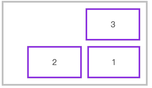
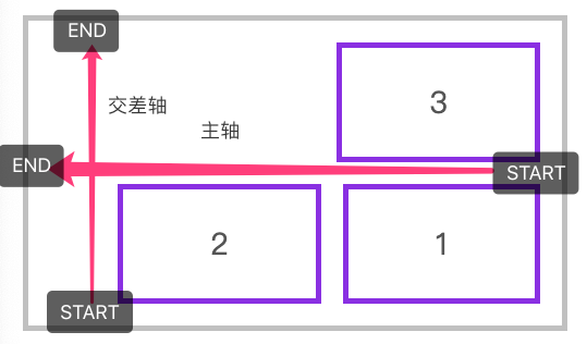
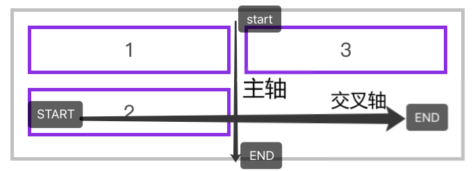
轴说明
水平排列
下面是使用 flex-flow: row wrap 的主轴与交叉轴说明。
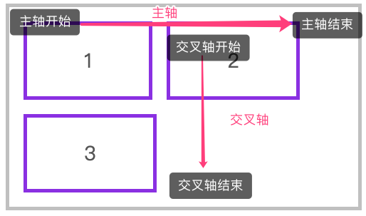
下面是使用 flex-flow: row-reverse wrap-reverse 的主轴与交叉轴说明。
垂直排列
下面是使用 flex-flow: column wrap 的主轴与交叉轴说明。
justify-content
📗 用于控制元素在主轴上的排列方式,再次强调是主轴的排列方式。
| 选项 | 说明 |
|---|---|
| flex-start | 元素紧靠主轴起点 |
| flex-end | 元素紧靠主轴终点 |
| center | 元素从弹性容器中心开始 |
| space-between | 第一个元素靠起点,最后一个元素靠终点,余下元素平均分配空间 |
| space-around | 每个元素两侧的间隔相等。所以,元素之间的间隔比元素与容器的边距的间隔大一倍 |
| space-evenly | 元素间距离平均分配 |
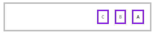
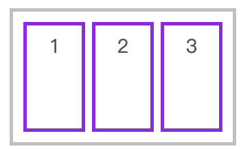
水平排列元素,并使用 justify-content: flex-end 对齐到主轴终点
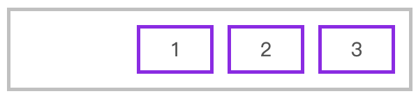
<style>
    * {
        padding: 0;
        margin: 0;
        padding: 10px;
        margin: 10px;
    }
    body {
        font-size: 14px;
        color: #555;
    }
    article {
        border: solid 5px silver;
        box-sizing: border-box;
        display: flex;
        flex-flow: row wrap;
        /* 紧靠主轴尾 */
        justify-content: flex-end;
    }
    article div {
        width: 80px;
        border: solid 5px blueviolet;
        text-align: center;
        font-size: 28px;
    }
</style>

<article>
    <div>1</div>
    <div>2</div>
    <div>3</div>
</article>
2
3
4
5
6
7
8
9
10
11
12
13
14
15
16
17
18
19
20
21
22
23
24
25
26
27
28
29
30
31
32
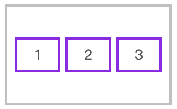
使用 space-evenly 平均分配容器元素
article {
    border: solid 5px silver;
    box-sizing: border-box;
    display: flex;
    flex-flow: row wrap;
    justify-content: space-evenly;
}
2
3
4
5
6
7
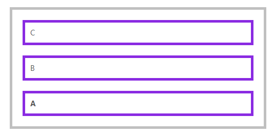
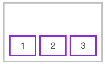
垂直排列时对齐到主轴终点
article {
    height: 400px;
    border: solid 5px silver;
    box-sizing: border-box;
    display: flex;
    flex-flow: column wrap;
    justify-content: flex-end;
}
2
3
4
5
6
7
8
交叉轴行 👾
📗 元素在交叉轴上有行的概念,理解这个概念会对理解align-items与align-content有更好的帮助。
- align-item是控制元素在行上的排列
- align-content是控制行在交差轴上的排列(参考justify-content)
align-items
📗 用于控制容器元素在交叉轴(行)上的排列方式。
| 选项 | 说明 |
|---|---|
| stretch | 元素被拉伸以适应容器(默认) |
| center | 元素位于容器的中心 |
| flex-start | 元素位于容器的交叉轴开头 |
| flex-end | 元素位于容器的交叉轴结尾 |
拉伸适应交叉轴
📌 如果设置了 width | height | min-height | min-width | max-width | max-height ,将影响stretch 的结果。(stretch的优先级高于width/height)
<style>
    * {
        padding: 0;
        margin: 0;
        padding: 10px;
        margin: 5px;
    }
    head {
        display: block;
    }
    body {
        font-size: 14px;
        color: #555;
    }
    article {
        height: 200px;
        border: solid 5px silver;
        box-sizing: border-box;
        display: flex;
        flex-direction: row;
        align-items: stretch;
    }
    article div {
        width: 80px;
        border: solid 5px blueviolet;
        text-align: center;
        font-size: 28px;
    }
</style>

<article>
    <div>1</div>
    <div>2</div>
    <div>3</div>
</article>
2
3
4
5
6
7
8
9
10
11
12
13
14
15
16
17
18
19
20
21
22
23
24
25
26
27
28
29
30
31
32
33
34
35
对齐到交叉轴的顶部
flex-direction: row;
align-items: flex-start;
2
对齐到交叉轴底部
flex-direction: row;
align-items: flex-end;
2
对齐到交叉轴中心
flex-direction: row;
align-items: center;
2
纵向排列时交叉轴排列
<style>
    * {
        padding: 0;
        margin: 0;
        padding: 10px;
        margin: 5px;
    }

    article {
        height: 400px;
        border: solid 5px silver;
        box-sizing: border-box;
        display: flex;
        flex-direction: column;
        align-items: center;
    }

    article div {
        height: 50px;
        min-width: 100px;
        border: solid 5px blueviolet;
        text-align: center;
        font-size: 28px;
    }
</style>

<article>
    <div>1</div>
    <div>2</div>
    <div>3</div>
</article>
2
3
4
5
6
7
8
9
10
11
12
13
14
15
16
17
18
19
20
21
22
23
24
25
26
27
28
29
30
31
align-content
📗 只适用于多行显示的弹性容器,用于控制行(而不是元素)在交叉轴上的排列方式。
| 选项 | 说明 |
|---|---|
| stretch | 将空间平均分配给元素 |
| flex-start | 元素紧靠主轴起点 |
| flex-end | 元素紧靠主轴终点 |
| center | 元素从弹性容器中心开始 |
| space-between | 第一个元素靠起点,最后一个元素靠终点,余下元素平均分配空间 |
| space-around | 每个元素两侧的间隔相等。所以,项目之间的间隔比项目与边框的间隔大一倍 |
| space-evenly | 元素间距离平均分配 |
水平排列在交叉轴中居中排列
<style>
    * {
        padding: 0;
        margin: 0;
        padding: 10px;
        margin: 5px;
    }
    article {
        height: 500px;
        border: solid 5px silver;
        box-sizing: border-box;
        display: flex;
        flex-direction: row;
        flex-wrap: wrap;
        /* 单行内的元素在头部对齐 */
        align-items: flex-start;
        /* 所有行都在中间排列 */
        align-content: center;
    }
    article div {
        width: 90px;
        border: solid 5px blueviolet;
        text-align: center;
        font-size: 28px;
    }
</style>

<article>
    <div>1</div>
    <div>2</div>
    <div>3</div>
</article>
2
3
4
5
6
7
8
9
10
11
12
13
14
15
16
17
18
19
20
21
22
23
24
25
26
27
28
29
30
31
32
垂直排列时交叉轴的排列
<style>
    * {
        padding: 0;
        margin: 0;
        padding: 10px;
        margin: 5px;
    }
    article {
        height: 300px;
        border: solid 5px silver;
        box-sizing: border-box;
        display: flex;
        flex-direction: column;
        flex-wrap: wrap;
        align-items: flex-start;
        /* 所有列都在中间排列 */
        align-content: center;
    }
    article div {
        min-width: 50px;
        min-height: 80px;
        border: solid 5px blueviolet;
        text-align: center;
        font-size: 28px;
    }
</style>

<article>
    <div>1</div>
    <div>2</div>
    <div>3</div>
</article>
2
3
4
5
6
7
8
9
10
11
12
13
14
15
16
17
18
19
20
21
22
23
24
25
26
27
28
29
30
31
32
弹性元素
放在容器盒子中的元素即为容器元素。
- 不能使用float与clear规则
- 弹性元素均为块元素
- 绝对定位的弹性元素不参与弹性布局
📌 绝对定位的失去了原来的文档位置,而相对定位的元素还保留原来的文档位置
align-self
📗 用于控制单个元素在交叉轴上的排列方式,align-items 用于控制容器中所有元素的排列,而 align-self 用于控制一个弹性元素的交叉轴排列。
| 选项 | 说明 |
|---|---|
| stretch | 将空间平均分配给元素 |
| flex-start | 元素紧靠主轴起点 |
| flex-end | 元素紧靠主轴终点 |
| center | 元素从弹性容器中心开始 |
<style>
    * {
        padding: 0;
        margin: 0;
        padding: 10px;
        margin: 5px;
    }
    article {
        height: 400px;
        border: solid 5px silver;
        box-sizing: border-box;
        display: flex;
        flex-direction: row;
        align-items: center;
    }
    article div {
        height: 50px;
        min-width: 50px;
        border: solid 5px blueviolet;
        text-align: center;
        font-size: 28px;
    }
    article div:nth-of-type(1) {
        align-self: flex-start;
    }
    article div:nth-of-type(3) {
        align-self: flex-end;
    }
</style>

<article>
    <div>1</div>
    <div>2</div>
    <div>3</div>
</article>
2
3
4
5
6
7
8
9
10
11
12
13
14
15
16
17
18
19
20
21
22
23
24
25
26
27
28
29
30
31
32
33
34
35
flex-grow
📗 用于将弹性盒子的可用空间,分配给弹性元素。可以使用整数或小数声明。
<style>
    * {
        padding: 0;
        margin: 0;
    }

    body {
        padding-left: 50px;
        padding-top: 15px;
    }

    article {
        border: solid 5px silver;
        width: 550px;
        height: 100px;
        display: flex;
        flex-direction: row;
    }

    article * {
        flex-grow: 1;
        width: 100px;
        height: 100px;
        background: blueviolet;
        background-clip: content-box;
        padding: 10px;
        box-sizing: border-box;
        font-size: 35px;
        color: white;
    }
</style>

<article>
    <div>1</div>
    <div>2</div>
    <div>3</div>
</article>
2
3
4
5
6
7
8
9
10
11
12
13
14
15
16
17
18
19
20
21
22
23
24
25
26
27
28
29
30
31
32
33
34
35
36
37
如果弹性元素设置了宽度,将把(弹性盒子-弹性元素宽度和)后按照 flex-grow 进行分配 。
下例中为三个DIV 弹性元素设置了1、3、6 ,即宽度分成10等份,第三个元素所占宽度为(宽度/(1+3+6)) X 6。
<style>
    * {
        padding: 0;
        margin: 0;
        padding: 10px;
        margin: 5px;
    }
    article {
        width: 600px;
        position: relative;
        height: 200px;
        border: solid 5px silver;
        display: flex;
    }
    article div {
        min-height: 80px;
        border: solid 5px blueviolet;
        text-align: center;
        font-size: 28px;
    }
    article div:nth-of-type(1) {
        width: 100px;
        flex-grow: 1;
    }
    article div:nth-of-type(2) {
        width: 100px;
        flex-grow: 3;
    }
    article div:nth-of-type(3) {
        width: 300px;
        flex-grow: 6;
    }
</style>
2
3
4
5
6
7
8
9
10
11
12
13
14
15
16
17
18
19
20
21
22
23
24
25
26
27
28
29
30
31
32
33
flex-shrink
📗 与 flex-grow 相反 flex-shrink 是在弹性盒子装不下元素时定义的缩小值。
下例在600宽的弹性盒子中放了 1000 宽的弹性元素。并为最后两个元素设置了缩放,最后一个元素的缩放比例为 500 -( ( (1000-600) / (100X1+400x3+500X6) ) x 3 ) X 500 = 220.9,计算公式说明如下:
缩小比例 = 不足的空间 / (元素 1 宽度 x 缩小比例) + (元素 2 宽度 x 缩小比例) ...
最终尺寸 = 元素三宽度 - (缩小比例 x  元素 3 的宽度) X 元素宽度
2
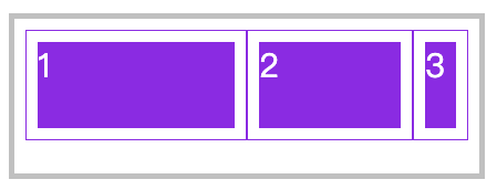
<style>
    * {
        padding: 0;
        margin: 0;
    }
    body {
        padding-left: 50px;
        padding-top: 15px;
    }
    article {
        border: solid 5px silver;
        width: 400px;
        height: 120px;
        display: flex;
        padding: 10px;
        box-sizing: content-box;
    }
    article div:nth-child(1) {
        flex-shrink: 0;
    }
    article div:nth-child(2) {
        flex-shrink: 1;
    }
    article div:nth-child(3) {
        flex-shrink: 3;
    }
    article * {
        width: 200px;
        height: 100px;
        overflow: hidden;
        background: blueviolet;
        background-clip: content-box;
        padding: 10px;
        border: solid 1px blueviolet;
        box-sizing: border-box;
        font-size: 30px;
        color: white;
    }
</style>

<article>
    <div>1</div>
    <div>2</div>
    <div>3</div>
</article>
2
3
4
5
6
7
8
9
10
11
12
13
14
15
16
17
18
19
20
21
22
23
24
25
26
27
28
29
30
31
32
33
34
35
36
37
38
39
40
41
42
43
44
45
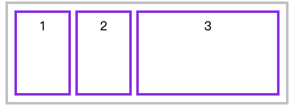
flex-basis
📗 flex-basis 属性定义了在分配多余空间之前,项目占据的主轴空间(main size)。浏览器根据这个属性,计算主轴是否有多余空间。
可以是长度单位,也可以是百分比。flex-basis的优先级高于width、height属性。
优先级
flex-basis 优先级大于 width、height。
<style>
    * {
        padding: 0;
        margin: 0;
    }
    article {
        width: 600px;
        position: relative;
        height: 150px;
        margin-left: 100px;
        margin-top: 100px;
        outline: solid 5px silver;
        display: flex;
        padding: 20px;
    }
    article div {
        outline: solid 5px blueviolet;
        text-align: center;
        font-size: 28px;
        line-height: 5em;
    }
    article div:nth-of-type(1) {
        flex-basis: 100px;
        width: 200px;
    }
    article div:nth-of-type(2) {
        flex-basis: 200px;
    }
    article div:nth-of-type(3) {
        flex-basis: 200px;
    }
</style>

<article>
    <div>1</div>
    <div>2</div>
    <div>3</div>
</article>
2
3
4
5
6
7
8
9
10
11
12
13
14
15
16
17
18
19
20
21
22
23
24
25
26
27
28
29
30
31
32
33
34
35
36
37
38
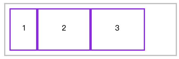
flex
📗 flex是flex-grow、flex-shrink 、flex-basis缩写组合。
建议使用 flex 面不要单独使用 flex-grow / flew-shrink / flex-basis 。
下例定义平均分配剩余空间,并不进行尺寸缩小,基础尺寸为200px。
* {
    padding: 0;
    margin: 0;
}
article {
    width: 600px;
    position: relative;
    height: 150px;
    margin-left: 100px;
    margin-top: 100px;
    outline: solid 5px silver;
    display: flex;
    padding: 20px;
}
article div {
    outline: solid 5px blueviolet;
    text-align: center;
    font-size: 28px;
    line-height: 5em;
    /* stretch: 1(等比占有); strink: 0(不缩小); 100px(初始值) */
    flex: 1 0 100px;
}
2
3
4
5
6
7
8
9
10
11
12
13
14
15
16
17
18
19
20
21
22
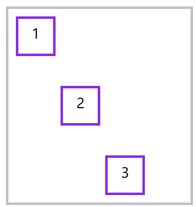
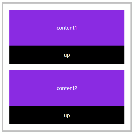
order
📗 用于控制弹性元素的位置,默认为 order:0 数值越小越在前面,可以负数或整数。
下面是通过J动态改变order属性产生移动效果,因为本章节是讲CSS所以JS功能没有完善,只是体验一下order。
<style>
    * {
        padding: 0;
        margin: 0;
    }

    body {
        padding-left: 50px;
        padding-top: 15px;
    }

    article {
        border: solid 5px silver;
        width: 400px;
        height: 400px;
        padding: 10px;
        display: flex;
        flex-direction: column;

    }

    article section {
        order: 1;
        flex: 1 0 100px;
        padding: 10px;
        background: blueviolet;
        background-clip: content-box;
        display: flex;
        flex-direction: column;
        text-align: center;
        color: white;
    }

    article section div {
        flex: 1;
    }

    article section div {
        display: flex;
        flex-direction: column;
        justify-content: center;
    }

    article section span {
        flex: 0;
        background: #000;
        padding: 20px;
        cursor: pointer;
    }
</style>

<article>
    <section>
        <div>content1</div>
        <span onclick="up(this)">up</span>
    </section>
    <section>
        <div>content2</div>
        <span onclick="up(this)">up</span>
    </section>
</article>

<script>
    function up(el) {
        el.parentElement.style.order = getOrder(el.parentElement) * 1 - 1;
        console.log(getOrder(el.parentElement))
    }

    function getOrder(el) {
        return getComputedStyle(el, null).order;
    }
</script>
2
3
4
5
6
7
8
9
10
11
12
13
14
15
16
17
18
19
20
21
22
23
24
25
26
27
28
29
30
31
32
33
34
35
36
37
38
39
40
41
42
43
44
45
46
47
48
49
50
51
52
53
54
55
56
57
58
59
60
61
62
63
64
65
66
67
68
69
70
71
72
弹性文本
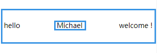
文本节点也在弹性布局操作范围内。
<style>
    article {
        display: flex;
        flex-direction: row;
        justify-content: space-between;
        height: 100vh;
        align-items: center;
        font-size: 14px;
    }
</style>

<article>
    hello
    <span> Michael </span>
    welcome !
</article>
2
3
4
5
6
7
8
9
10
11
12
13
14
15
16
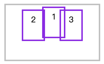
绝对定位
绝对定位的弹性元素不参与弹性布局(绝对定位的元素已经失去了原始的文档位置,而相对定位保持)
<style>
    * {
        padding: 0;
        margin: 0;
        padding: 10px;
        margin: 5px;
    }
    article {
        position: relative;
        height: 400px;
        border: solid 5px silver;
        box-sizing: border-box;
        display: flex;
        justify-content: space-evenly;
        align-items: flex-start;
    }
    article div {
        min-width: 50px;
        min-height: 80px;
        border: solid 5px blueviolet;
        text-align: center;
        font-size: 28px;
    }
    article div:nth-of-type(1) {
        position: absolute;
        top: 0;
    }
</style>

<article>
    <div>1</div>
    <div>2</div>
    <div>3</div>
</article>
2
3
4
5
6
7
8
9
10
11
12
13
14
15
16
17
18
19
20
21
22
23
24
25
26
27
28
29
30
31
32
33
34
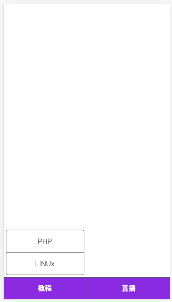
微信公众号
下面来开发类似微信公众号布局,包括底部二级菜单的弹性布局。
<style>
    * {
        padding: 0;
        margin: 0;
    }

    body {
        display: flex;
        flex-direction: column;
        height: 100vh;
        color: #666;
    }

    main {
        flex: 1;
    }

    footer {
        height: 50px;
        background: blueviolet;
        display: flex;
        justify-content: space-evenly;
    }

    footer section {
        display: flex;
        flex: 1 0;
        flex-direction: column-reverse;
        border-right: solid 1px #555;
        border-top: solid 1px #555;
    }

    footer section:last-child {
        border-right: none;
    }

    footer section h4 {
        flex: 0 0 50px;
        display: flex;
        text-align: center;
        flex-direction: column;
        justify-content: center;
        cursor: pointer;
        color: white;
    }

    footer section ul {
        text-align: center;
        display: flex;
        flex-direction: column;
        border: solid 1px #555;
        margin-bottom: 5px;
        border-radius: 5px;
        margin: 5px;
    }

    footer section ul li {
        flex: 1 0 50px;
        border-bottom: solid 1px #555;
        display: flex;
        flex-direction: column;
        justify-content: center;
        cursor: pointer;
    }

    footer section ul li:last-child {
        border: none;
    }
</style>
...

<main></main>
<footer>
    <section>
        <h4>教程</h4>
        <ul>
            <li>PHP</li>
            <li>LINUx</li>
        </ul>
    </section>
    <section>
        <h4>直播</h4>
    </section>
</footer>
2
3
4
5
6
7
8
9
10
11
12
13
14
15
16
17
18
19
20
21
22
23
24
25
26
27
28
29
30
31
32
33
34
35
36
37
38
39
40
41
42
43
44
45
46
47
48
49
50
51
52
53
54
55
56
57
58
59
60
61
62
63
64
65
66
67
68
69
70
71
72
73
74
75
76
77
78
79
80
81
82
83
84
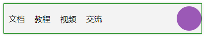
自动空间
在弹性布局中对元素使用margin-right:auto 等形式可以自动撑满空间。下例为第一个ul设置 margin-right:auto 表示右侧空间自动撑满,第二个ul靠近父元素右边界。(flex: 1也可以达到这个效果)
<head>
    <meta charset="UTF-8">
    <meta name="viewport" content="width=device-width, initial-scale=1.0">
    <style>
        * {
            padding: 0;
            margin: 0;
        }

        .container {
            width: 1200px;
            margin: 0 auto;
        }

        nav {
            display: flex;
            border: solid 1px green;
            margin-top: 20px;
            align-items: center;
            height: 60px;
            box-shadow: 0 0 5px rgba(0, 0, 0, .2);
            background: #f3f3f3;
        }

        ul {
            list-style: none;
        }

        ul:nth-child(1) {
            display: flex;
            align-items: center;
            margin-right: auto;
        }

        ul:nth-child(1)>li {
            margin: 0 10px;
        }

        ul:nth-child(2)>li {
            width: 50px;
            height: 50px;
            border-radius: 50%;
            background: #9b59b6;
        }
    </style>
</head>

<body>
    <div class="container">
        <nav>
            <ul>
                <li>文档</li>
                <li>教程</li>
                <li>视频</li>
                <li>交流</li>
            </ul>
            <ul>
                <li>
                </li>
            </ul>
        </nav>
    </div>
</body>
2
3
4
5
6
7
8
9
10
11
12
13
14
15
16
17
18
19
20
21
22
23
24
25
26
27
28
29
30
31
32
33
34
35
36
37
38
39
40
41
42
43
44
45
46
47
48
49
50
51
52
53
54
55
56
57
58
59
60
61
62
63