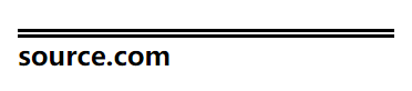
盒子模型
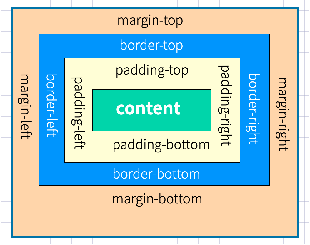
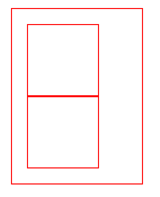
外边距
声明定义
边距顺序依次为:上、右、下、左。
<style>
main {
border: solid 1px red;
width: 500px;
height: 500px;
margin: 0 auto;
}
h2 {
border: solid 2px green;
width: 300px;
height: 300px;
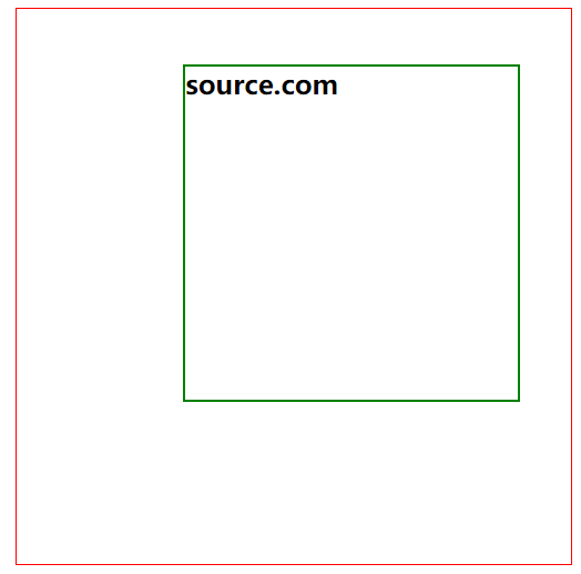
margin: 50px 80px 100px 150px;
}
</style>
<main>
<h2>source.com</h2>
</main>
1
2
3
4
5
6
7
8
9
10
11
12
13
14
15
16
17
18
19
2
3
4
5
6
7
8
9
10
11
12
13
14
15
16
17
18
19
下例定义上下50px边距,左右80px边距
margin: 50px 80px;
1
下面将边距全部定义为 100px
margin:100px;
1
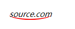
居中设置
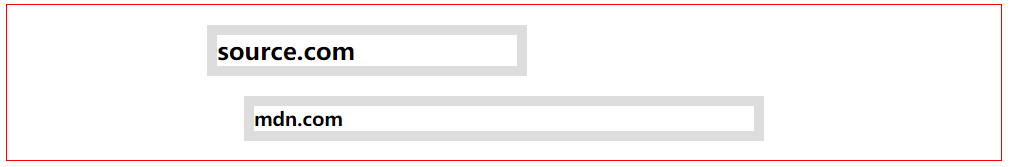
margin 设置auto 后,浏览器会自动居中
<style>
    article {
        border: solid 1px red;
    }

    h2,h3 {
        border: solid 10px #ddd;
    }

    h2 {
        width: 300px;
        margin-left: 200px;
        margin-right: 200px;
    }

    h3 {
        width: 500px;
        margin-left: auto;
        margin-right: auto;
    }
</style>

<article>
    <h2>source.com</h2>
    <h3>mdn.com</h3>
</article>
1
2
3
4
5
6
7
8
9
10
11
12
13
14
15
16
17
18
19
20
21
22
23
24
25
26
2
3
4
5
6
7
8
9
10
11
12
13
14
15
16
17
18
19
20
21
22
23
24
25
26
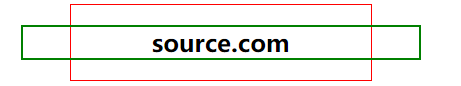
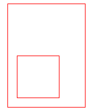
负值设置
<style>
    main {
        border: solid 1px red;
        width: 300px;
        margin: 0 auto;
    }

    h2 {
        border: solid 2px green;
        margin-left: -50px;
        margin-right: -50px;
        text-align: center;
    }
</style>

<main>
    <h2>source.com</h2>
</main>
1
2
3
4
5
6
7
8
9
10
11
12
13
14
15
16
17
18
2
3
4
5
6
7
8
9
10
11
12
13
14
15
16
17
18
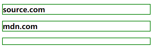
边距合并
相邻元素的纵向外边距会进行合并
<style>
    h2 {
        border: solid 2px green;
        margin-bottom: 20px;
    }

    h3 {
        border: solid 2px green;
        height: 20px;
    }
</style>

<h2>source.com</h2>
<h2>mdn.com</h2>
<h3></h3>
1
2
3
4
5
6
7
8
9
10
11
12
13
14
15
2
3
4
5
6
7
8
9
10
11
12
13
14
15
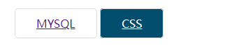
内边距
内边距使用 padding 进行定义,使用语法与 margin 相似。
基本使用
<style>
    a {
        padding: 10px 30px;
        border: solid 1px #ddd;
        border-radius: 5px;
    }

    a:hover {
        background: rgb(3, 78, 110);
        color: white;
    }
</style>

<a href="">MYSQL</a>
<a href="">CSS</a>
1
2
3
4
5
6
7
8
9
10
11
12
13
14
15
2
3
4
5
6
7
8
9
10
11
12
13
14
15
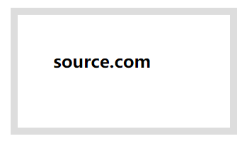
BOX-SIZING
📒 content-box和border box的区别在于:两者的盒子的宽度是否包含表框和内边距
- content-box(默认样式)
- border-box:元素宽度只包括内容
宽度与高度包括内边距与边框border-box (200px * 120px)
<style>
    h2 {
        border: solid 10px #ddd;
        height: 60px;
        width: 200px;
        padding:50px;
        box-sizing: content-box;
    }
</style>

<h2>source.com</h2>
1
2
3
4
5
6
7
8
9
10
11
2
3
4
5
6
7
8
9
10
11
边框设计
样式选择
| 类型 | 描述 |
|---|---|
| none | 定义无边框。 |
| dotted | 定义点状边框。在大多数浏览器中呈现为实线。 |
| dashed | 定义虚线。在大多数浏览器中呈现为实线。 |
| solid | 定义实线。 |
| double | 定义双线。双线的宽度等于 border-width 的值。 |
| groove | 定义 3D 凹槽边框。其效果取决于 border-color 的值。 |
| ridge | 定义 3D 垄状边框。其效果取决于 border-color 的值。 |
| inset | 定义 3D inset 边框。其效果取决于 border-color 的值。 |
| outset | 定义 3D outset 边框。其效果取决于 border-color 的值。 |
一次定义四个边
h2 {
    border-style: double;
}
1
2
3
2
3
样式顺序为上、右、下、左,可以分别进行定义
h2 {
    border-style: outset solid dotted double;
    border-width: 8px;
}
1
2
3
4
2
3
4
单独设置一边样式
| 规则 | 说明 |
|---|---|
| border-top-style | 顶边 |
| border-right-style | 右边 |
| border-bottom-style | 下边 |
| border-left-style | 左边 |
| border-style | 四边 |
h2 {
    border-top-style: double;
    border-width: 8px;
}
1
2
3
4
2
3
4
边框宽度
边框可以通过以下规则来设置
| 规则 | 说明 |
|---|---|
| border-top-width | 顶边 |
| border-right-width | 右边 |
| border-bottom-width | 下边 |
| border-left-width | 左边 |
| border-width | 四边 |
边框颜色
| 规则 | 说明 |
|---|---|
| border-top-color | 顶边 |
| border-right-color | 右边 |
| border-bottom-color | 下边 |
| border-left-color | 左边 |
| border-color | 四边 |
简写规则
| 规则 | 说明 |
|---|---|
| border-top | 顶边 |
| border-right | 右边 |
| border-bottom | 下边 |
| border-left | 左边 |
| border | 四边 |
设置底部边框
border-bottom: solid 5px red;
1
行元素边框
行元素也可以进行边框设置
em {
    border-bottom: solid 2px red;
}
1
2
3
2
3
圆角边框 👾
使用 border-radius 规则设置圆角,可以使用px | % 等单位。也支持四个边分别设置。
| 选项 | 说明 |
|---|---|
| border-top-left-radius | 上左 |
| border-top-right-radius | 上右 |
| border-bottom-left-radius | 下载 |
| border-bottom-right-radius | 下右 |
h2 {
    border-radius: 10px;
    border: solid 2px red;
}
1
2
3
4
2
3
4
通过边框绘制圆
div {
    width: 100px;
    height: 100px;
    border: solid 3px red;
    border-radius: 50%;
}
1
2
3
4
5
6
2
3
4
5
6
定义不同边
border-radius: 10px 30px 50px 100px;
1
行元素绘制圆角
em {
	border-radius: 50%;
	border-bottom: solid 2px red;
}
1
2
3
4
2
3
4
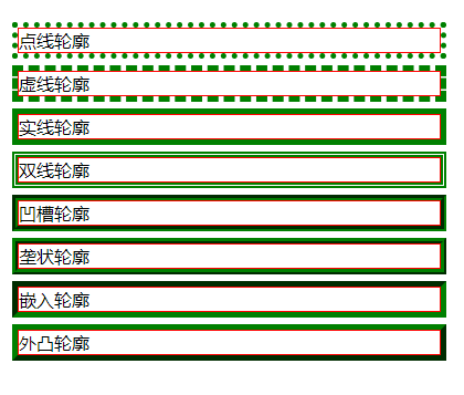
轮廓线
元素在获取焦点时产生,并且轮廓线不占用空间。可以使用伪类 :focus 定义样式。
- 轮廓线显示在边框外面
- 轮廓线不影响页面布局
线条样式
| 值 | 描述 |
|---|---|
| none | 默认。定义无轮廓。 |
| dotted | 定义点状的轮廓。 |
| dashed | 定义虚线轮廓。 |
| solid | 定义实线轮廓。 |
| double | 定义双线轮廓。双线的宽度等同于 outline-width 的值。 |
| groove | 定义 3D 凹槽轮廓。此效果取决于 outline-color 值。 |
| ridge | 定义 3D 凸槽轮廓。此效果取决于 outline-color 值。 |
| inset | 定义 3D 凹边轮廓。此效果取决于 outline-color 值。 |
| outset | 定义 3D 凸边轮廓。此效果取决于 outline-color 值。 |
<style>
    p {
        border: 1px solid red;
        /* outline: green dotted thick; */
        outline-color: green;
        outline-width: thick;
    }

    p.dotted {
        outline-style: dotted;
    }
    ...
</style>
<p class="dotted">点线轮廓</p>
<p class="dashed">虚线轮廓</p>
<p class="solid">实线轮廓</p>
<p class="double">双线轮廓</p>
<p class="groove">凹槽轮廓</p>
<p class="ridge">垄状轮廓</p>
<p class="inset">嵌入轮廓</p>
<p class="outset">外凸轮廓</p>
1
2
3
4
5
6
7
8
9
10
11
12
13
14
15
16
17
18
19
20
21
2
3
4
5
6
7
8
9
10
11
12
13
14
15
16
17
18
19
20
21
线宽设置
outline-width: 10px;
1
线条颜色
outline-color: red;
1
组合定义
outline: red solid 2px;
1
表单轮廓线 👾
表单默认具有轮廓线,但有时并不好看,使用以下样式规则去除。
input:focus {
	outline: none;
}
1
2
3
2
3
DISPLAY
控制显示隐藏
使用 display 控制元素的显示机制。
| 选项 | 说明 |
|---|---|
| none | 隐藏元素 |
| block | 显示为块元素 |
| inline | 显示为行元素,不能设置宽/高 |
| inline-block | 行级块元素,允许设置宽/高 |
行转块元素
<style>
    a {
        border: solid 1px #ddd;
        display: block;
        margin-bottom: 5px;
    }
</style>

<a href="">source.com</a>
<a href="">source.com</a>
<a href="">source.com</a>
1
2
3
4
5
6
7
8
9
10
11
2
3
4
5
6
7
8
9
10
11
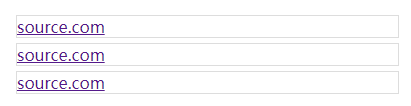
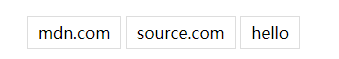
块转为行元素
<style>
    ul>li {
        display: inline;
        padding: 5px 10px;
        border: solid 1px #ddd;
    }

    ul>li:hover {
        background: green;
        color: white;
        cursor: pointer;
    }
</style>
<ul>
    <li>mdn.com</li>
    <li>source.com</li>
    <li>hello</li>
</ul>
1
2
3
4
5
6
7
8
9
10
11
12
13
14
15
16
17
18
2
3
4
5
6
7
8
9
10
11
12
13
14
15
16
17
18
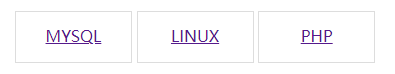
行级块使用
将a标签转为inline-block之后,可以设置其高度 📌
<style>
    a {
        display: inline-block;
        width: 30%;
        height: 50px;
        border: solid 1px #ddd;
        text-align: center;
        line-height: 3em;
    }
</style>

<a href="">MYSQL</a>
<a href="">LINUX</a>
<a href="">PHP</a>
1
2
3
4
5
6
7
8
9
10
11
12
13
14
2
3
4
5
6
7
8
9
10
11
12
13
14
VISIBILITY
控制元素的显示隐藏,在隐藏后空间位也保留。
<style>
    article {
        padding: 30px;
        border: solid 2px red;
        width: 200px;
    }
    article div {
        width: 100px;
        height: 100px;
        border: solid 2px red;
        padding: 20px;
    }
    article div:nth-of-type(1) {
        visibility: hidden;
    }
</style>

<article>
    <div></div>
    <div></div>
</article>
1
2
3
4
5
6
7
8
9
10
11
12
13
14
15
16
17
18
19
20
21
2
3
4
5
6
7
8
9
10
11
12
13
14
15
16
17
18
19
20
21
溢出控制
隐藏控制
| 选项 | 说明 |
|---|---|
| hidden | 溢出内容隐藏 |
| scroll | 显示滚动条(有些浏览器会一直显示,有些在滚动时显示) |
| auto | 根据内容自动处理滚动条 |
溢出隐藏
div {
    width: 400px;
    height: 100px;
    border: solid 2px #ddd;
    padding: 20px;
    overflow: hidden;
}
1
2
3
4
5
6
7
2
3
4
5
6
7
溢出产生滚动条
不同浏览器处理方式不同,有些直接显示出来,有些在滚动时才显示。
div {
    width: 400px;
    height: 100px;
    border: solid 2px #ddd;
    padding: 20px;
    overflow: scroll;
}
1
2
3
4
5
6
7
2
3
4
5
6
7
文本溢出 👾
单行文本溢出
div {
    width: 400px;
    height: 100px;
    border: solid 2px #ddd;
    padding: 20px;
    overflow: hidden;
    text-overflow: ellipsis;
    white-space: nowrap;
}
1
2
3
4
5
6
7
8
9
2
3
4
5
6
7
8
9
多行文本溢出控制
div {
    width: 400px;
    border: solid 2px #ddd;
    overflow: hidden;
    display: -webkit-box;
    -webkit-line-clamp: 3;
    -webkit-box-orient: vertical;
}
1
2
3
4
5
6
7
8
2
3
4
5
6
7
8
尺寸定义
可以使用多种方式为元素设置宽、高尺寸。
| 选项 | 说明 |
|---|---|
| width | 宽度 |
| height | 高度 |
| min-width | 最小宽度 |
| min-height | 最小高度 |
| max-width | 最大宽度 |
| max-height | 最大高度 |
| fill-available | 撑满可用的空间 |
| fit-content | 根据内容适应尺寸 |
min&max
正文中不希望图片太大造成溢出窗口,也不希望太小影响美观,使用以下代码可以做到约束。
<style>
    div {
        width: 600px;
        border: solid 2px #ddd;
        padding: 20px;
    }
    div img {
        min-width: 50%;
        max-width: 90%;
    }
</style>
1
2
3
4
5
6
7
8
9
10
11
2
3
4
5
6
7
8
9
10
11
fill-available 👾
在chrome 浏览器中使用前缀 -webkit 书写样式。
下面是行块元素可以撑满可用空间后的效果。

<style>
    * {
        padding: 0;
        margin: 0;
    }

    body {
        width: 100vw;
        height: 100vh;
        background: #2c3e50;
    }

    main {
        background: #9b59b6;
        height: 100px;
        padding: 20px;
        box-sizing: border-box;
    }

    span {
        background: #e67e22;
        display: inline-block;
        width: -webkit-fill-available;
        height: -webkit-fill-available;
    }
</style>

<main>
    <span>
        source.com
    </span>
</main>
1
2
3
4
5
6
7
8
9
10
11
12
13
14
15
16
17
18
19
20
21
22
23
24
25
26
27
28
29
30
31
32
2
3
4
5
6
7
8
9
10
11
12
13
14
15
16
17
18
19
20
21
22
23
24
25
26
27
28
29
30
31
32
fit-content
下面是根据内容自动适应宽度,让元素居中显示的效果。(h2原本作为block元素宽度是100%)

<style>
    * {
        padding: 0;
        margin: 0;
    }

    body {
        width: 100vw;
        height: 100vh;
        background: #2c3e50;
    }

    h2 {
        text-align: center;
        background: #f1c40f;
        width: fit-content;
        margin: auto;
    }
</style>

<h2>source.com</h2>
1
2
3
4
5
6
7
8
9
10
11
12
13
14
15
16
17
18
19
20
21
2
3
4
5
6
7
8
9
10
11
12
13
14
15
16
17
18
19
20
21
min-content
使用min-content 将容器尺寸按最小元素宽度设置。

<style>
    * {
        padding: 0;
        margin: 0;
    }

    body {
        width: 100vw;
        height: 100vh;
        background: #2c3e50;
    }

    main {
        width: min-content;
        margin: auto;
    }

    div {
        margin-bottom: 20px;
        background: #f1c40f;
        word-break: break-all;
        padding: 10px;
    }

    div:nth-child(1) {
        width: 100px;
    }
</style>


<main>
    <div>source.com</div>
    <div>mdn.com</div>
</main>
1
2
3
4
5
6
7
8
9
10
11
12
13
14
15
16
17
18
19
20
21
22
23
24
25
26
27
28
29
30
31
32
33
34
2
3
4
5
6
7
8
9
10
11
12
13
14
15
16
17
18
19
20
21
22
23
24
25
26
27
28
29
30
31
32
33
34
max-content
容器尺寸按子元素最大宽度设置。

<style>
    * {
        padding: 0;
        margin: 0;
    }

    body {
        width: 100vw;
        height: 100vh;
        background: #2c3e50;
    }

    main {
        width: max-content;
        margin: auto;
    }

    div {
        margin-bottom: 20px;
        background: #f1c40f;
        word-break: break-all;
        padding: 10px;
    }
</style>

<main>
    <div>source.com</div>
    <div>mdn.com</div>
</main>
1
2
3
4
5
6
7
8
9
10
11
12
13
14
15
16
17
18
19
20
21
22
23
24
25
26
27
28
29
30
2
3
4
5
6
7
8
9
10
11
12
13
14
15
16
17
18
19
20
21
22
23
24
25
26
27
28
29
30