变形动画
基础知识
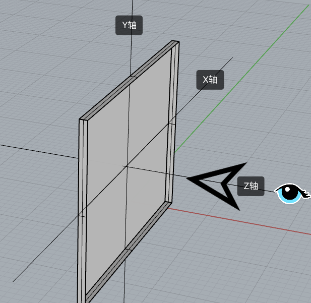
坐标系统
📗 要使用元素变形操作需要掌握坐标轴,然后通过改变不同坐标来控制元素的变形。
👾 例如在rotate下,我们的视角是 +Z到 -Z,横线为 X, Y为垂直轴
- X轴是水平轴
- Y轴是垂直轴
- Z轴是纵深轴
变形操作
📗 使用 transform 规则控制元素的变形操作,包括控制移动、旋转、倾斜、3D转换等
下面是CSS提供的变形动作。
| 选项 | 说明 |
|---|---|
| none | 定义不进行转换。 |
| translate(x,y) | 定义 2D 转换。 |
| translate3d(x,y,z) | 定义 3D 转换。 |
| translateX(x) | 定义转换,只是用 X 轴的值。 |
| translateY(y) | 定义转换,只是用 Y 轴的值。 |
| translateZ(z) | 定义 3D 转换,只是用 Z 轴的值。 |
| scale(x,y) | 定义 2D 缩放转换。 |
| scale3d(x,y,z) | 定义 3D 缩放转换。 |
| scaleX(x) | 通过设置 X 轴的值来定义缩放转换。 |
| scaleY(y) | 通过设置 Y 轴的值来定义缩放转换。 |
| scaleZ(z) | 通过设置 Z 轴的值来定义 3D 缩放转换。 |
| rotate(angle) | 定义 2D 旋转,在参数中规定角度。 |
| rotate3d(x,y,z,angle) | 定义 3D 旋转。 |
| rotateX(angle) | 定义沿着 X 轴的 3D 旋转。 |
| rotateY(angle) | 定义沿着 Y 轴的 3D 旋转。 |
| rotateZ(angle) | 定义沿着 Z 轴的 3D 旋转。 |
| skew(x-angle,y-angle) | 定义沿着 X 和 Y 轴的 2D 倾斜转换。 |
| skewX(angle) | 定义沿着 X 轴的 2D 倾斜转换。 |
| skewY(angle) | 定义沿着 Y 轴的 2D 倾斜转换。 |
| perspective(n) | 为 3D 转换元素定义透视视图。 |
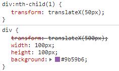
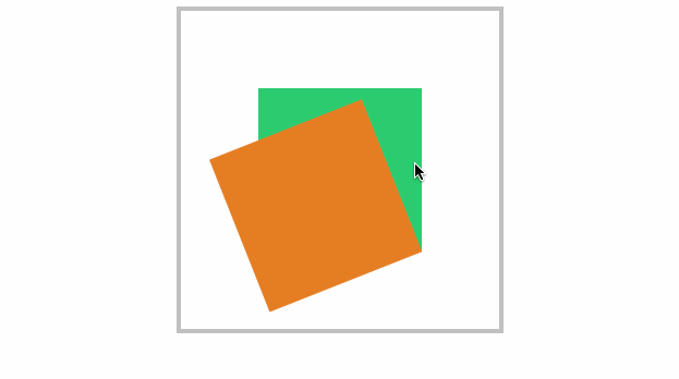
变形叠加
📗 ~~重复设置(声明)~~变形操作时只在原形态上操作。
默认处理
下面声明了两次移动,并不会移动 550px 而是只移动50px。
div {
    transform: translateX(500px);
    width: 100px;
    height: 100px;
    background: #9b59b6;
}
div:nth-child(1) {
    transform: translateX(50px);
}
2
3
4
5
6
7
8
9
伪类叠加

<style>
    div {
        transition: 2s;
        /* 相当于translateX(250px) */
        transform: translateX(200px) translateX(50px);
        width: 100px;
        height: 100px;
        background: #9b59b6;
    }

    div:hover {
        transition: 2s;
        /* hover之后从x轴250px位置移动回100px位置 */
        transform: translateX(100px);
    }
</style>

<div></div>
2
3
4
5
6
7
8
9
10
11
12
13
14
15
16
17
18
行级元素
👾 行级元素不产生变形效果,将其转为 inline-block 或 block 以及弹性元素时都可以产生变化效果。
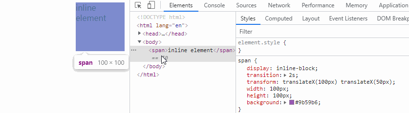
<style>
    span {
        display: inline-block;
        transition: 2s;
        transform: translateX(100px) translateX(50px);
        width: 100px;
        height: 100px;
        background: #9b59b6;
    }

    span:hover {
        transition: 2s;
        transform: translateX(100px);
    }
</style>

<span></span>
2
3
4
5
6
7
8
9
10
11
12
13
14
15
16
17
伪类状态
:hover
鼠标移动上后发生改变。

article div:nth-child(2):hover {
    transform: rotate(180deg);
}
2
3
:target
以下操作变化时间为零秒,通过掌握后面的过渡动画可以控制变化时间。
当页面链接有#elementId时,对应的element的css伪类:target生效
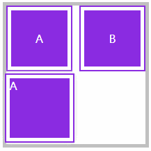
<style>
    article {
        width: 200px;
        height: 200px;
        display: grid;
        gap: 10px;
        grid-template-columns: repeat(2, 1fr);
        grid-template-rows: repeat(2, 1fr);
        position: relative;
        border: solid 5px silver;
        color: white;
    }

    article div a {
        color: white;
        text-decoration: none;
    }

    article div,
    article div aside {
        background: blueviolet;
        background-clip: content-box;
        padding: 5px;
        border: solid 2px blueviolet;
        box-sizing: border-box;
        display: flex;
        justify-content: center;
        align-items: center;
        position: relative;
    }

    article div aside {
        position: absolute;
        display: none;
        width: 100px;
        height: 100px;
    }

    aside:target {
        display: block;
        transform: translateY(100px);
        box-shadow: 0 0 10px #ddd;
    }
</style>

<article>
    <div>
        <a href="#a">A</a>
        <aside id="a">
            A
        </aside>
    </div>
    <div>
        <a href="#b">B</a>
        <aside id="b">
            B
        </aside>
    </div>
</article>
2
3
4
5
6
7
8
9
10
11
12
13
14
15
16
17
18
19
20
21
22
23
24
25
26
27
28
29
30
31
32
33
34
35
36
37
38
39
40
41
42
43
44
45
46
47
48
49
50
51
52
53
54
55
56
57
58
59
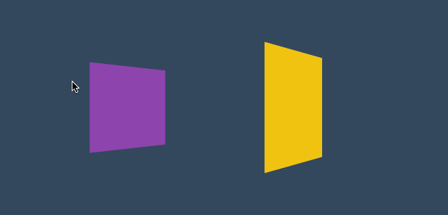
移动元素
- 沿X轴移动时正值向右移动、负值向左移动
- 沿Y轴移动时正值向下移动、负值向上移动
- 如果使用百分数将控制元素的原尺寸计算百分比然后移动 📌
- 可同时设置多个值,解析器会从左向右依次执行
- 变形是在原基础上更改,即第二次设置值时不是在第一次值上变化 (可以同时设置,但是重复声明不会叠加)
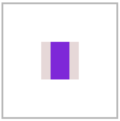
translateX
正值向右移动、负值向左移动。
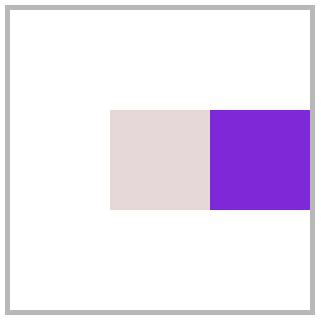
<style>
    article {
        width: 300px;
        height: 300px;
        position: relative;
        border: solid 5px silver;
    }

    article div {
        width: 100px;
        height: 100px;
        background: blueviolet;
        box-sizing: border-box;
        position: absolute;
        left: 50%;
        margin-left: -50px;
        top: 50%;
        margin-top: -50px;
    }

    article div:nth-child(1) {
        background: #e9dddd;
    }

    article div:nth-child(2) {
        transform: translateX(100px);
    }
</style>

<article>
    <div></div>
    <div></div>
</article>
2
3
4
5
6
7
8
9
10
11
12
13
14
15
16
17
18
19
20
21
22
23
24
25
26
27
28
29
30
31
32
33
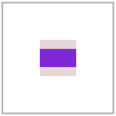
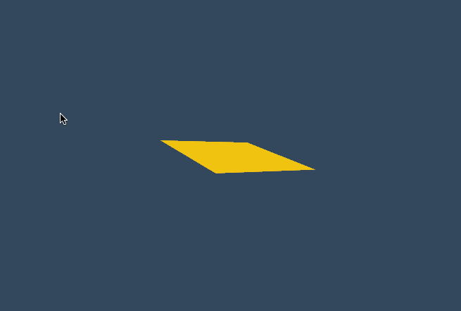
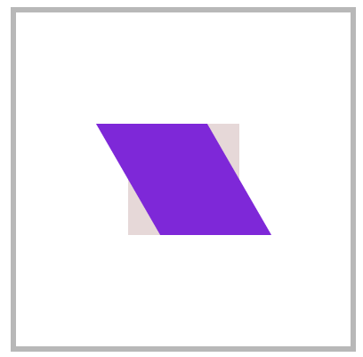
translateY
正值向下移动、负值向上移动。
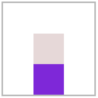
article div:nth-child(2) {
	transform: translateY(100px);
}
2
3
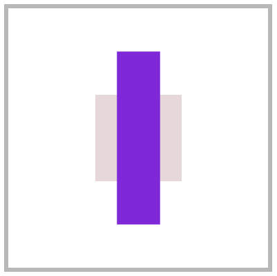
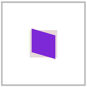
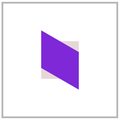
translate
📗 使用 translate 可以控制按X、Y同时移动操作,第一个值控制X移动,第二个值控制Y移动。
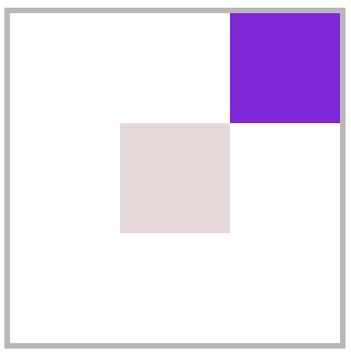
article div:nth-child(2) {
    transform: translate(100px, -100px);
}
2
3
百分比移动
📗 元素宽度为100px设置50%时将移动50px,即百分比是指元素的尺寸的百分比。
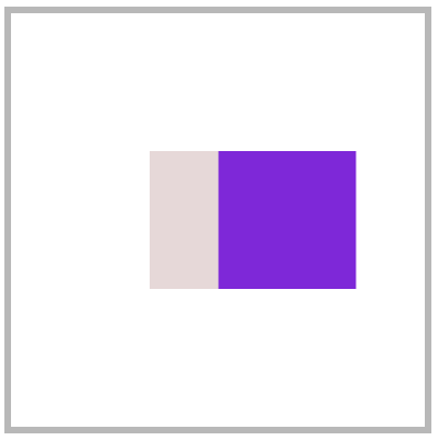
article div:nth-child(2) {
	transform: translateX(50%);
}
2
3
元素居中
📗 居中可以使用多种方式,如弹性布局、定位操作,下面是使用移动操作居中。
<style>
    body {
        height: 100vh;
    }

    main {
        width: 400px;
        height: 400px;
        border: solid 5px silver;
        position: relative;
    }

    main div {
        width: 100px;
        height: 100px;
        background: blueviolet;
        position: absolute;
        left: 50%;
        top: 50%;
        transform: translate(-50%, -50%);
    }
</style>

<main>
    <div></div>
</main>
2
3
4
5
6
7
8
9
10
11
12
13
14
15
16
17
18
19
20
21
22
23
24
25
26
translateZ
📗 控制Z轴移动,正数向外、负数向里移动。因为Z轴是透视轴没有像X/Y一样的固定尺寸,所以不能使用百分数。
<style>
    * {
        padding: 0;
        margin: 0;
        box-sizing: border-box;
        list-style: none;
    }

    body {
        width: 100vw;
        height: 100vh;
        background: #34495e;
    }

    main {
        position: absolute;
        left: 50%;
        top: 50%;
        width: 200px;
        height: 200px;
        transform-style: preserve-3d;
        transition: 2s;
        transform: perspective(900px) rotateY(60deg);
    }

    body:hover main {
        transform: perspective(600px) rotateY(60deg) scaleZ(5);
    }

    div {
        position: absolute;
        top: 0;
        left: 0;
        width: 100%;
        height: 100%;
        background: #f1c40f;
    }

    div.b {
        background: #8e44ad;
        transform: translateZ(-100px);
    }
</style>

<main>
    <div class="f"></div>
    <div class="b"></div>
</main>
2
3
4
5
6
7
8
9
10
11
12
13
14
15
16
17
18
19
20
21
22
23
24
25
26
27
28
29
30
31
32
33
34
35
36
37
38
39
40
41
42
43
44
45
46
47
48
translate3d
📗 用于同时控制X/Y/Z轴的移动,三个值必须输入如果某个轴不需要移动时设置为零。

<style>
    * {
        padding: 0;
        margin: 0;
        box-sizing: border-box;
        list-style: none;
    }

    body {
        width: 100vw;
        height: 100vh;
        background: #34495e;
    }

    main {
        position: absolute;
        left: 50%;
        top: 50%;
        width: 200px;
        height: 200px;
        background: #f1c40f;
        perspective: 600px;
        transform: perspective(600px) rotateY(35deg);
        transition: 2s;
    }

    body:hover main {
        transform: perspective(600px) rotateY(35deg) translate3d(50%, 50%, 200px);
    }
</style>

<main>
    <div></div>
</main>
2
3
4
5
6
7
8
9
10
11
12
13
14
15
16
17
18
19
20
21
22
23
24
25
26
27
28
29
30
31
32
33
34
渐变表单
<style>
    * {
        margin: 0;
        padding: 0;
    }

    body {
        background-color: #34495e;
    }

    main {
        margin: 200px auto;
        width: fit-content;
    }

    .field {
        margin-bottom: 12px;
        position: relative;
        overflow: hidden;
        background-color: #ecf0f1;
    }

    .field::before {
        content: "";
        position: absolute;
        background: linear-gradient(to right, #fff, #7f8c8d, #e74c3c, #f1c40f, #1abc9c, #fff);
        bottom: 0;
        height: 1px;
        left: 0;
        right: 0;
        transition: 2s;
        transform: translateX(-100%);
    }

    .field:hover::before {
        transform: translateX(100%);
    }

    .field input {
        border: 0;
        height: 32px;
        font-size: 18px;
        line-height: 30px;
        padding: 6px;
        outline: none;
    }
</style>

<main>
    <div class="field">
        <input type="text"></input>
    </div>
	<div class="field">
    	<input type="text"></input>
	</div>
</main>
2
3
4
5
6
7
8
9
10
11
12
13
14
15
16
17
18
19
20
21
22
23
24
25
26
27
28
29
30
31
32
33
34
35
36
37
38
39
40
41
42
43
44
45
46
47
48
49
50
51
52
53
54
55
56
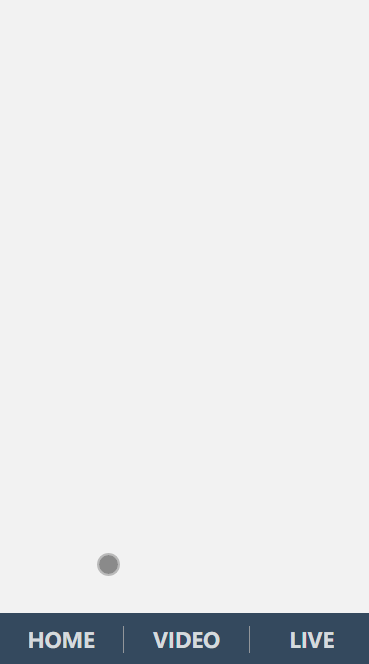
页面切换 💡
下面是使用移动效果制作的页面切换效果。
<link rel="stylesheet" href="https://maxcdn.bootstrapcdn.com/font-awesome/4.7.0/css/font-awesome.min.css">
<style>
    * {
        padding: 0;
        margin: 0;
    }

    a {
        text-decoration: none;
    }

    body {
        display: flex;
        width: 100vw;
        height: 100vh;
        flex-direction: column;
    }

    main {
        position: relative;
        background: #f3f3f3;
        flex: 1;
        overflow: hidden;
    }

    nav {
        display: flex;
        justify-content: space-around;
        align-items: center;
        height: 8vh;
        text-align: center;
        background: #34495e;
    }

    nav a {
        flex: 1;
        font-size: 1.3em;
        text-transform: uppercase;
        font-weight: bold;
        opacity: .8;
        color: white;
    }

    nav a:nth-child(2) {
        border-right: solid 1px #aaa;
        border-left: solid 1px #aaa;
    }

    main>div {
        position: absolute;
        left: 0;
        top: 0;
        width: 100%;
        height: 100%;
        transition: all 1s;
        z-index: 1;
        background: #f3f3f3;
        opacity: 0;
        display: flex;
        flex-direction: column;
        justify-content: center;
        align-items: center;
        transform: translate(0, -100%);
        color: white;
        font-size: 2em;
    }

    /* target时将透明度转化为1,将卡片移动到页面原始位置 */
    main>div:target {
        opacity: 1;
        transform: translate(0%, 0%);
    }

    main>div:nth-of-type(1):target {
        background: #3498db;
    }

    main>div:nth-of-type(2):target {
        background: #9b59b6;
    }

    main>div:nth-of-type(3):target {
        background: #16a085;
    }

    div i[class^="fa"] {
        font-size: 100px;
        color: white;
    }
</style>

<body>
    <main>
        <div id="home">
            <i class="fa fa-home" aria-hidden="true"></i>
            Jerry Chen
        </div>
        <div id="video">
            <i class="fa fa-vimeo" aria-hidden="true"></i>
        </div>
        <div id="live">
            <i class="fa fa-viadeo" aria-hidden="true"></i>
        </div>
    </main>
    <nav>
        <a href="#home">home</a>
        <a href="#video">video</a>
        <a href="#live">live</a>
    </nav>
</body>
2
3
4
5
6
7
8
9
10
11
12
13
14
15
16
17
18
19
20
21
22
23
24
25
26
27
28
29
30
31
32
33
34
35
36
37
38
39
40
41
42
43
44
45
46
47
48
49
50
51
52
53
54
55
56
57
58
59
60
61
62
63
64
65
66
67
68
69
70
71
72
73
74
75
76
77
78
79
80
81
82
83
84
85
86
87
88
89
90
91
92
93
94
95
96
97
98
99
100
101
102
103
104
105
106
107
108
109
110
缩放元素
比如数值为2时表示为原尺寸的两倍。
scaleX
下面是沿X轴缩放一半。(缩放指的是轴的缩放,不是元素的缩放📌)
article div:nth-child(2) {
	transform: scaleX(.5);
}
2
3
scaleY
下面是沿Y轴缩放一半。
article div:nth-child(2) {
	transform: scaleY(.5);
}
2
3
scale
使用 scale 可同时设置 X/Y 轴的缩放,如果只设置一个值时表示两轴缩放相同。
使用数值定义缩放,如 .5 表示缩小一半,2 表示放大两倍。
article div:nth-child(2) {
	transform: scale(.5, 2);
}
2
3
scaleZ
沿Z轴缩放元素,需要有3D透视才可以查看到效果。
<style>
    * {
        padding: 0;
        margin: 0;
        box-sizing: border-box;
    }

    body {
        width: 100vw;
        height: 100vh;
    }

    main {
        position: absolute;
        left: 50%;
        top: 50%;
        transform: translate(-50%, -50%);
        width: 400px;
        height: 400px;
        border: solid 5px silver;
        transform-style: preserve-3d;
        transform: perspective(900px) rotateY(45deg);
        transition: 3s;
    }

    div {
        position: absolute;
        left: 50%;
        top: 50%;
        margin-left: -100px;
        margin-top: -100px;
        width: 200px;
        height: 200px;
    }

    div:nth-child(1) {
        background: #2ecc71;
    }

    div:nth-child(2) {
        background: #e67e22;
        transition: 1s;
        transform: translateZ(-300px);
    }

    body:hover main {
        /* Z轴放大3倍实现距离拉长 */
        transform: perspective(900px) rotateY(45deg) scaleZ(3);
    }
</style>

<main>
    <div></div>
    <div></div>
</main>
2
3
4
5
6
7
8
9
10
11
12
13
14
15
16
17
18
19
20
21
22
23
24
25
26
27
28
29
30
31
32
33
34
35
36
37
38
39
40
41
42
43
44
45
46
47
48
49
50
51
52
53
54
55
scale3d
沿X/Y/Z三个轴绽放元素。

<style>
    * {
        padding: 0;
        margin: 0;
        box-sizing: border-box;
        list-style: none;
    }

    body {
        width: 100vw;
        height: 100vh;
        background: #34495e;
    }

    main {
        position: absolute;
        left: 50%;
        top: 50%;
        width: 200px;
        height: 200px;
        transform-style: preserve-3d;
        transition: 2s;
        transform: perspective(900px) rotateY(60deg)
    }

    body:hover main {
        transform: perspective(600px) rotateY(60deg) scale3d(2, 2, 4);
    }

    div {
        position: absolute;
        top: 0;
        left: 0;
        width: 100%;
        height: 100%;
        background: #f1c40f;
    }

    div.b {
        background: #8e44ad;
        transform: translateZ(-100px);
    }
</style>

<main>
    <div class="f"></div>
    <div class="b"></div>
</main>
2
3
4
5
6
7
8
9
10
11
12
13
14
15
16
17
18
19
20
21
22
23
24
25
26
27
28
29
30
31
32
33
34
35
36
37
38
39
40
41
42
43
44
45
46
47
48
菜单缩放
<style>
    * {
        padding: 0;
        margin: 0;
    }

    body {
        background: #34495e;
    }

    main {
        position: absolute;
        left: 50%;
        top: 50%;
        transform: translate(-50%, -50%);
    }

    ul {
        list-style: none;
        display: flex;
        justify-content: space-evenly;
        width: 200px;
    }

    ul li {
        position: relative;
    }

    ul li strong {
        background: #e67e22;
        color: #2c3e50;
        padding: 2px 20px;
        cursor: pointer;
        text-transform: uppercase;
    }

    ul li strong+div {
        border: solid 2px #e67e22;
        display: flex;
        flex-direction: column;
        padding: 10px 20px;
        position: absolute;
        /* 设置缩放为0即不显示,设置放缩的原点 */
        transform-origin: left top;
        transform: scale(0);
        z-index: -1;
        transition: .6s;
        background: #e67e22;
    }

    ul li strong+div a {
        display: inline-block;
        padding: 5px;
        font-size: 1em;
        color: #2c3e50;
        text-decoration: none;
        text-transform: uppercase;
    }

    ul li:hover strong+div {
        transform: scale(1);
    }
</style>

<main>
    <ul>
        <li>
            <strong>one</strong>
            <div>
                <a href="">- 1</a>
                <a href="">- 2</a>
                <a href="">- 3</a>
            </div>
        </li>
        <li>
            <strong>two</strong>
            <div>
                <a href="">- 4</a>
                <a href="">- 5</a>
                <a href="">- 6</a>
            </div>
        </li>
    </ul>
</main>
2
3
4
5
6
7
8
9
10
11
12
13
14
15
16
17
18
19
20
21
22
23
24
25
26
27
28
29
30
31
32
33
34
35
36
37
38
39
40
41
42
43
44
45
46
47
48
49
50
51
52
53
54
55
56
57
58
59
60
61
62
63
64
65
66
67
68
69
70
71
72
73
74
75
76
77
78
79
80
81
82
83
84
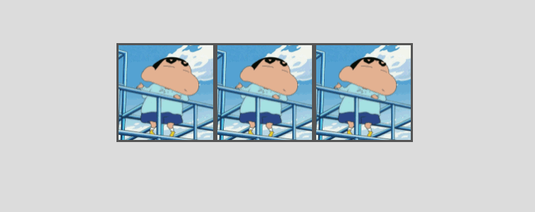
相册放大 💡
下面是使用缩放开发相册放大效果的示例。
<style>
    body {
        display: flex;
        justify-content: center;
        align-items: center;
        height: 100vh;
        background: #ddd;
    }

    main {
        display: flex;
        justify-content: center;
        align-items: center;
    }

    main div {
        height: 200px;
        width: 200px;
        background: white;
        border: solid 1px #ddd;
        transition: all .5s;
        display: flex;
        justify-content: center;
        align-items: center;
        font-size: 1.5em;
        text-transform: uppercase;
        color: blueviolet;
        overflow: hidden;
        border: solid 3px #555;
        box-sizing: border-box;
    }

    main div img {
        height: 100%;
    }

    main:hover div {
        /* main hover时将所有的div缩放,并设置一个模糊值 */
        transform: scale(.8) translateY(-30px);
        cursor: pointer;
        filter: blur(15px);
    }

    main div:hover {
        transform: scale(1.6);
        color: white;
        filter: none;
        z-index: 2;
    }

    main div:hover::after {
        content: '';
        position: absolute;
        background: #000;
        width: 100%;
        height: 100%;
        z-index: -1;
        box-shadow: 0 0 5px rgba(0, 0, 0, .3);
    }
</style>

<main>
    <div><img src="1.png" alt=""></div>
    <div><img src="1.png" alt=""></div>
    <div><img src="1.png" alt=""></div>
</main>
2
3
4
5
6
7
8
9
10
11
12
13
14
15
16
17
18
19
20
21
22
23
24
25
26
27
28
29
30
31
32
33
34
35
36
37
38
39
40
41
42
43
44
45
46
47
48
49
50
51
52
53
54
55
56
57
58
59
60
61
62
63
64
65
66
旋转操作
使用CSS可以控制元素按照不同坐标轴进行旋转。
rotateX
控制元素按照X轴进行旋转操作。
基本使用
按水平轴发生旋转,如果旋转90deg 将不可见。
article div:nth-child(2) {
    transform: rotateX(180deg);
}
2
3
下面是旋转89deg后,只会看到一条线。
父级透视
当X旋转90度后无法看到元素,这时可以控制父级旋转从上看子元素。
<style>
    * {
        padding: 0;
        margin: 0;
        box-sizing: border-box;
    }

    main {
        position: absolute;
        left: 50%;
        top: 50%;
        margin-left: -200px;
        margin-top: -200px;
        width: 400px;
        height: 400px;
        border: solid 5px silver;
        transform-style: preserve-3d;
        transform: perspective(900px) rotateX(-45deg);
    }

    div {
        position: absolute;
        left: 50%;
        top: 50%;
        margin-left: -100px;
        margin-top: -100px;
        width: 200px;
        height: 200px;
        transition: 1s;
    }

    div:nth-child(1) {
        background: #2ecc71;
    }

    main:hover div:nth-child(1) {
        transform: perspective(900px) rotateX(90deg) rotateY(25deg) rotateZ(45deg);
    }
</style>

<main>
    <div></div>
</main>
2
3
4
5
6
7
8
9
10
11
12
13
14
15
16
17
18
19
20
21
22
23
24
25
26
27
28
29
30
31
32
33
34
35
36
37
38
39
40
41
42
43
rotateY
按垂直轴旋转,如果旋转90deg 将不可见。
article div:nth-child(2) {
    transform: rotateY(180deg);
}
2
3
rotateZ
没Z轴旋转元素,效果就是沿X/Y轴的平面旋转。

<style>
    * {
        padding: 0;
        margin: 0;
        box-sizing: border-box;
        list-style: none;
    }

    body {
        width: 100vw;
        height: 100vh;
        background: #34495e;
    }

    main {
        position: absolute;
        left: 50%;
        top: 50%;
        width: 200px;
        height: 200px;
        background: #f1c40f;
        perspective: 600px;
        transform: perspective(600px) rotateY(35deg);
        transition: 2s;
    }

    body:hover main {
        transform: perspective(600px) rotateY(35deg) rotateZ(160deg);
    }
</style>

<main>
    <div></div>
</main>
2
3
4
5
6
7
8
9
10
11
12
13
14
15
16
17
18
19
20
21
22
23
24
25
26
27
28
29
30
31
32
33
34
rotate
在X与Y轴平面旋转,效果与使用 rotateZ 相同。
article div:nth-child(2) {
	transform: rotate(45deg); /* Equal to rotateZ(45deg) */
}
2
3
rotate3d
同时设置X/Y/Z轴的旋转向量值来控制元素的旋转。
需要同时设置如下四个参数
rotate3d(tx,ty,tz,angle)
只转X轴
<style>
    * {
        padding: 0;
        margin: 0;
        box-sizing: border-box;
        list-style: none;
    }

    body {
        width: 100vw;
        height: 100vh;
        background: #34495e;
    }

    main {
        position: absolute;
        left: 50%;
        top: 50%;
        width: 200px;
        height: 200px;
        background: #f1c40f;
        perspective: 600px;
        transform: perspective(600px) rotateY(35deg);
        transition: 2s;
    }

    body:hover main {
        transform: perspective(600px) rotateY(35deg) rotate3d(1, 0, 0, -645deg);
    }
</style>

<main>
    <div></div>
</main>
2
3
4
5
6
7
8
9
10
11
12
13
14
15
16
17
18
19
20
21
22
23
24
25
26
27
28
29
30
31
32
33
34
只转Y轴

body:hover main {
	transform: perspective(600px) rotateY(-645deg);
}
2
3
只转Z轴
XY旋转

body:hover main {
	transform: perspective(600px) rotateY(35deg) rotate3d(1, 1, 0, -645deg);
}
2
3
XZ转换
加入适当的Z向量值,可增加元素沿Z轴旋转的力度。

body:hover main {
	transform: perspective(600px) rotateY(35deg) rotate3d(1, 0, .5, -245deg);
}
2
3
参数顺序
可以同时设置多个旋转规则,顺序不同结果也会不同。(参考矩阵的乘法,顺序不同结果也不同)
article div:nth-child(2) {
	transform: rotateX(30deg) rotateY(30deg);
}
2
3
旋转文字
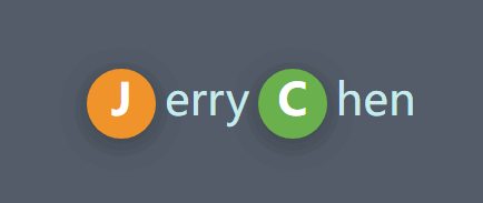
<style>
    * {
        padding: 0;
        margin: 0;
    }

    body {
        height: 100vh;
        display: flex;
        flex-direction: column;
        justify-content: center;
        align-items: center;
    }

    main {
        margin: 0 auto;
        width: 400px;
        height: 50vh;
        display: flex;
        flex-direction: column;
        justify-content: center;
        align-items: center;
        background: #535c68;
    }

    main div {
        color: #c7ecee;
        cursor: pointer;
    }

    main div strong {
        display: inline-block;
        width: 25px;
        height: 25px;
        margin: 0 3px;
        background: #000;
        border-radius: 50%;
        transition: 2s;
        color: white;
        text-align: center;
        box-shadow: 0 2px 10px rgba(0, 0, 0, .3);
    }

    main div strong:nth-of-type(1) {
        background: #f0932b;
    }

    main div strong:nth-of-type(2) {
        background: #6ab04c;
    }

    main div:hover strong:nth-of-type(1) {
        transform: rotate(360deg);
    }

    main div:hover strong:nth-of-type(2) {
        transform: rotate(-360deg);
    }
</style>

<main>
    <div>
        <strong>J</strong>erry<strong>C</strong>hen
    </div>
</main>
2
3
4
5
6
7
8
9
10
11
12
13
14
15
16
17
18
19
20
21
22
23
24
25
26
27
28
29
30
31
32
33
34
35
36
37
38
39
40
41
42
43
44
45
46
47
48
49
50
51
52
53
54
55
56
57
58
59
60
61
62
63
64
65
电子时钟 🕒

<style>
    body {
        display: flex;
        justify-content: center;
        align-items: center;
        height: 100vh;
        background: #34495e;
    }

    main {
        position: relative;
        width: 400px;
        height: 400px;
        background: #34495e;
        border-radius: 50%;
        box-shadow: 0 0 10px rgba(0, 0, 0, .7);
    }

    main::before {
        position: absolute;
        left: 0;
        top: 0;
        content: '';
        width: 100%;
        height: 100%;
        border-radius: 50%;
        transform: scale(1.2);
        background: radial-gradient(at right, #27ae60, #e67e22, #e74c3c, #e67e22, #27ae60);
        z-index: -1;
    }

    main .line>div {
        position: absolute;
        left: 50%;
        top: 50%;
        width: 10px;
        height: 95%;
        background: white;
    }

    main .line>div:nth-child(1) {
        transform: translate(-50%, -50%) rotate(0deg);
    }

    main .line>div:nth-child(2) {
        transform: translate(-50%, -50%) rotate(30deg);
    }

    main .line>div:nth-child(3) {
        transform: translate(-50%, -50%) rotate(60deg);
    }

    main .line>div:nth-child(4) {
        transform: translate(-50%, -50%) rotate(90deg);
    }

    main .line>div:nth-child(5) {
        transform: translate(-50%, -50%) rotate(120deg);
    }

    main .line>div:nth-child(6) {
        transform: translate(-50%, -50%) rotate(150deg);
    }

    main>div[class="mark"] {
        position: absolute;
        width: 100%;
        height: 100%;
        left: 0%;
        top: 0%;
        background: #34495e;
        border-radius: 50%;
        transform: scale(.8);
    }

    main>.point {
        width: 20px;
        height: 20px;
        background: #e74c3c;
        border-radius: 50%;
        position: absolute;
        top: 50%;
        left: 50%;
        transform: translate(-50%, -50%);
        z-index: 2;
    }

    main .hour {
        width: 15px;
        position: absolute;
        height: 25%;
        background: #95a5a6;
        left: 50%;
        bottom: 50%;
        transform: translate(-50%, 0);
    }

    main .minute {
        width: 8px;
        position: absolute;
        height: 35%;
        background: #3498db;
        left: 50%;
        bottom: 50%;
        transform-origin: left bottom;
        transform: translate(-50%, 0) rotate(60deg);
    }

    main .second {
        width: 2px;
        position: absolute;
        height: 35%;
        background: #f1c40f;
        left: 50%;
        bottom: 50%;
        transform-origin: left bottom;
        transform: translate(-50%, 0) rotate(90deg);
    }

    main:hover .second {
        transition: 10s;
        transform: rotate(260deg);
    }

    main .text {
        font-size: 1.2em;
        color: white;
        position: absolute;
        top: 50%;
        left: 50%;
        transform: translate(-50%, 20px);
        text-transform: uppercase;
        opacity: .5;
        text-align: center;
    }
</style>

<main>
    <section class="line">
        <div></div>
        <div></div>
        <div></div>
        <div></div>
        <div></div>
        <div></div>
    </section>
    <div class="mark"></div>
    <div class="point"></div>
    <div class="hour"></div>
    <div class="minute"></div>
    <div class="second"></div>
    <div class="text">
        blog.caffreygo.com <br>
        乌拉拉
    </div>
</main>
2
3
4
5
6
7
8
9
10
11
12
13
14
15
16
17
18
19
20
21
22
23
24
25
26
27
28
29
30
31
32
33
34
35
36
37
38
39
40
41
42
43
44
45
46
47
48
49
50
51
52
53
54
55
56
57
58
59
60
61
62
63
64
65
66
67
68
69
70
71
72
73
74
75
76
77
78
79
80
81
82
83
84
85
86
87
88
89
90
91
92
93
94
95
96
97
98
99
100
101
102
103
104
105
106
107
108
109
110
111
112
113
114
115
116
117
118
119
120
121
122
123
124
125
126
127
128
129
130
131
132
133
134
135
136
137
138
139
140
141
142
143
144
145
146
147
148
149
150
151
152
153
154
155
156
倾斜操作
skew: 歪斜
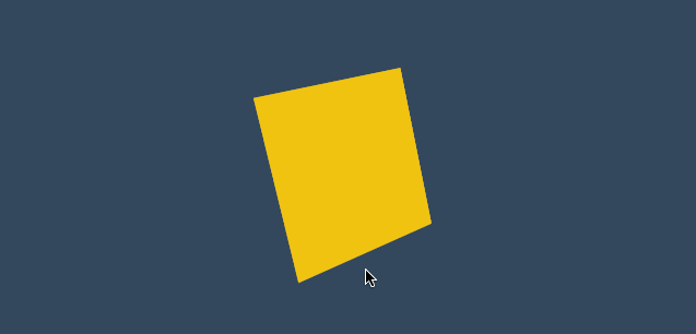
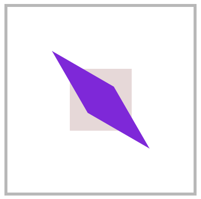
skewX
没X轴倾斜元素
article div:nth-child(2) {
	transform: skewX(30deg);
}
2
3
skewY
沿Y轴倾斜元素
article div:nth-child(2) {
	transform: skewY(30deg);
}
2
3
skew
同时设置X/Y轴倾斜操作,不指定第二个参数时Y轴倾斜为零。
article div:nth-child(2) {
	transform: skew(30deg, 30deg);
}
2
3
按钮特效 💡
Y轴不倾斜,上下保持水平;X轴倾斜,左右出现斜边。
<style>
    * {
        padding: 0;
        margin: 0;
    }

    body {
        background: #34495e;
    }

    main {
        /* 绝对定位+移动 实现居中 */
        position: absolute;
        left: 50%;
        top: 50%;
        transform: translate(-50%, -50%);
    }

    main .btn {
        display: block;
        height: 30px;
        width: 150px;
        border: solid 2px #e74c3c;
        background: none;
        color: white;
        position: relative;
        text-align: center;
        display: flex;
        justify-content: center;
        align-items: center;
        overflow: hidden;
        cursor: pointer;
        box-shadow: 0 3px 8px rgba(0, 0, 0, .3);
    }

    main .btn::before {
        transition: all .8s;
        align-self: center;
        content: '';
        position: absolute;
        width: 0;
        height: 100%;
        background: #e74c3c;
        z-index: -1;
        transform: skewX(-45deg);
    }

    main .btn:hover::before {
        width: 200%;
    }
</style>

<main>
    <a class="btn">
        JERRYCHEN
    </a>
</main>
2
3
4
5
6
7
8
9
10
11
12
13
14
15
16
17
18
19
20
21
22
23
24
25
26
27
28
29
30
31
32
33
34
35
36
37
38
39
40
41
42
43
44
45
46
47
48
49
50
51
52
53
54
55
56
57
立体按钮 👾
<style>
    * {
        padding: 0;
        margin: 0;
        box-sizing: border-box;
    }

    body {
        background: #2c3e50;
        width: 100vw;
        height: 100vh;
        display: flex;
        justify-content: center;
        align-items: center;
    }

    .btn {
        color: #ecf0f1;
        text-decoration: none;
        width: 200px;
        height: 40px;
        background: #e74c3c;
        display: flex;
        justify-content: center;
        align-items: center;
        position: relative;
        transform: skewX(25deg) rotate(-15deg);
        letter-spacing: .5em;
        text-transform: uppercase;
        font-weight: bold;
    }

    .btn::before {
        /* 上下边倾斜,skewY */
        content: '';
        width: 10px;
        height: 100%;
        left: -10px;
        background: #000;
        position: absolute;
        transform: skewY(-45deg) translate(0, 5px);
    }

    .btn::after {
        /* 左右边倾斜,skewX */
        content: '';
        width: 100%;
        height: 10px;
        bottom: -10px;
        background: #000;
        position: absolute;
        transform: skewX(-45deg) translate(-5px, 0);
    }
</style>

<a href="" class="btn">JerryChen</a>
2
3
4
5
6
7
8
9
10
11
12
13
14
15
16
17
18
19
20
21
22
23
24
25
26
27
28
29
30
31
32
33
34
35
36
37
38
39
40
41
42
43
44
45
46
47
48
49
50
51
52
53
54
55
56
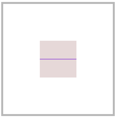
变形基点
使用 transform-origin 设置元素的X/YZ操作的基点,用于控制旋转、倾斜等操作。
transfrom-origin
- 旋转默认以元素中心进行旋转,改变基点后可控制旋转点位置
- 元素移动不受变形基点所影响
- 基点是元素原始空间位,而不是translate移动后的空间位
平面旋转
<style>
    * {
        padding: 0;
        margin: 0;
        box-sizing: border-box;
    }

    main {
        position: absolute;
        left: 50%;
        top: 50%;
        margin-left: -200px;
        margin-top: -200px;
        width: 400px;
        height: 400px;
        border: solid 5px silver;
    }

    div {
        position: absolute;
        left: 50%;
        top: 50%;
        margin-left: -100px;
        margin-top: -100px;
        width: 200px;
        height: 200px;
        /* 默认是 center center 元素绕中心旋转 */
        transform-origin: right bottom;
    }

    div:nth-child(1) {
        background: #2ecc71;
    }

    div:nth-child(2) {
        background: #e67e22;
        transition: 1s;
    }

    main:hover div:nth-child(2) {
        transform: rotate(-45deg);
    }
</style>

<main>
    <div></div>
    <div></div>
</main>
2
3
4
5
6
7
8
9
10
11
12
13
14
15
16
17
18
19
20
21
22
23
24
25
26
27
28
29
30
31
32
33
34
35
36
37
38
39
40
41
42
43
44
45
46
47
48
倾斜控制
参考右上角控制倾斜。
<style>
    * {
        padding: 0;
        margin: 0;
        box-sizing: border-box;
    }

    main {
        position: absolute;
        left: 50%;
        top: 50%;
        margin-left: -200px;
        margin-top: -200px;
        width: 400px;
        height: 400px;
        border: solid 5px silver;
    }

    div {
        position: absolute;
        left: 50%;
        top: 50%;
        margin-left: -100px;
        margin-top: -100px;
        width: 200px;
        height: 200px;
        transform-origin: top left;
    }

    div:nth-child(1) {
        background: #fff;
    }

    div:nth-child(2) {
        background: #e67e22;
        transition: 1s;
    }

    main:hover div:nth-child(2) {
        transform: skew(45deg);
    }
</style>

<main>
    <div></div>
    <div></div>
</main>
2
3
4
5
6
7
8
9
10
11
12
13
14
15
16
17
18
19
20
21
22
23
24
25
26
27
28
29
30
31
32
33
34
35
36
37
38
39
40
41
42
43
44
45
46
47
三维旋转
<style>
    * {
        padding: 0;
        margin: 0;
        box-sizing: border-box;
    }

    main {
        position: absolute;
        left: 50%;
        top: 50%;
        margin-left: -200px;
        margin-top: -200px;
        width: 400px;
        height: 400px;
        border: solid 5px silver;
        transform-style: preserve-3d;
        transform: perspective(900px) rotateY(95deg);
    }

    div {
        position: absolute;
        left: 50%;
        top: 50%;
        margin-left: -100px;
        margin-top: -100px;
        width: 200px;
        height: 200px;
        transform-origin: center center 200px;
    }

    div:nth-child(1) {
        background: #2ecc71;
    }

    div:nth-child(2) {
        background: #e67e22;
        transition: 1s;
    }

    main:hover div:nth-child(2) {
        transform: rotateY(360deg);
    }
</style>

<main>
    <div></div>
    <div></div>
</main>
2
3
4
5
6
7
8
9
10
11
12
13
14
15
16
17
18
19
20
21
22
23
24
25
26
27
28
29
30
31
32
33
34
35
36
37
38
39
40
41
42
43
44
45
46
47
48
49
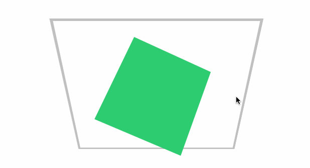
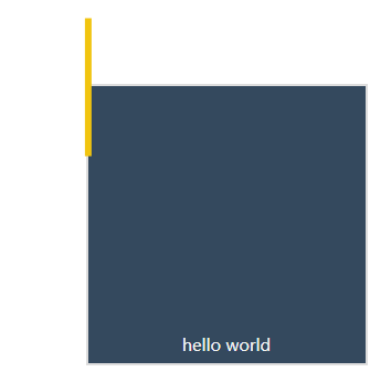
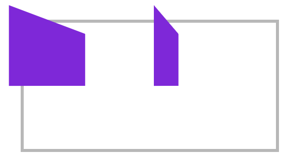
变形顺序的影响
设置transform变形的前后顺序对变形结果是有影响
下面先写rotate 后写translate,即先按原位置的 transform-origin: top left 进行旋转,再按原位置的transform-origin: top left进行移动
<style>
    body {
        width: 100vw;
        height: 100vh;
        display: flex;
        justify-content: center;
        align-items: center;
    }
    article {
        width: 200px;
        height: 200px;
        border: solid 2px #ddd;
        position: relative;
        background: #34495e;
    }
    article div {
        width: 5px;
        height: 100px;
        background: #000;
        transition: 2s;
        position: absolute;
        transform-origin: top left;
        transform: rotate(0deg) translate(-50%, -50%);
        background-color: #f1c40f;
    }
    article::after {
        content: 'hello world';
        width: 100%;
        color: #f3f3f3;
        font-size: 12px;
        position: absolute;
        bottom: 5px;
        text-align: center;
    }
    article:hover div {
        transform: rotate(360deg) translate(-50%, -50%);
    }
</style>

<article>
    <div></div>
</article>
2
3
4
5
6
7
8
9
10
11
12
13
14
15
16
17
18
19
20
21
22
23
24
25
26
27
28
29
30
31
32
33
34
35
36
37
38
39
40
41
42
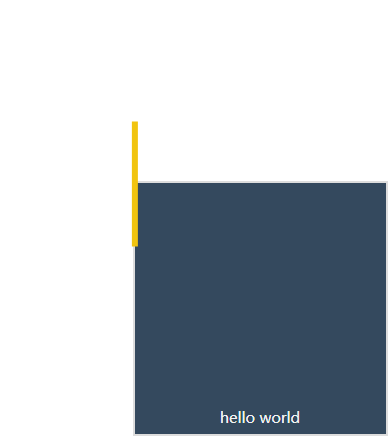
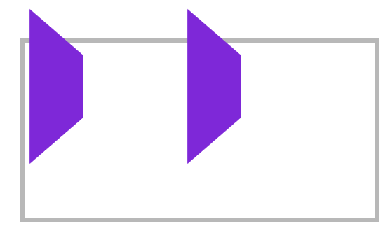
现在交换 rotate 与 translate的顺序后,表示先移动元素,这时候旋转就是参考移动后的位置的 transform-origin: top left;结果如下
<style>
  body {
    width: 100vw;
    height: 100vh;
    display: flex;
    justify-content: center;
    align-items: center;
  }
  article {
    width: 200px;
    height: 200px;
    border: solid 2px #ddd;
    position: relative;
    background: #34495e;
  }
  article div {
    width: 5px;
    height: 100px;
    background: #000;
    transition: 2s;
    position: absolute;
    transform-origin: top left;
    transform: translate(-50%, -50%) rotate(0deg);
    background-color: #f1c40f;
  }
  article::after {
    content: 'hello world';
    width: 100%;
    color: #f3f3f3;
    font-size: 12px;
    position: absolute;
    bottom: 5px;
    text-align: center;
  }
  article:hover div {
    transform: translate(-50%, -50%) rotate(360deg);
  }
</style>

<article>
  <div></div>
</article>
2
3
4
5
6
7
8
9
10
11
12
13
14
15
16
17
18
19
20
21
22
23
24
25
26
27
28
29
30
31
32
33
34
35
36
37
38
39
40
41
42
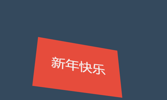
新年贺卡 💡
下面是通过设置基点来制作贺卡的效果。
<style>
    * {
        padding: 0;
        margin: 0;
        box-sizing: border-box;
    }

    body {
        width: 100vw;
        height: 100vh;
        background: #34495e;
        display: flex;
        justify-content: center;
        align-items: center;
    }

    main {
        width: 300px;
        height: 200px;
    }

    .card {
        width: 300px;
        height: 200px;
        background: #e67e22;
        display: flex;
        justify-content: center;
        align-items: center;
        font-size: 3em;
        color: whitesmoke;
        position: relative;
        transform-style: preserve-3d;
        transform: perspective(900px) rotateX(35deg) rotateY(15deg);
    }

    .card::before,
    .card::after {
        transition: 1s;
        background: #e74c3c;
        line-height: 4em;
    }

    .card::before {
        content: '新年';
        width: 150px;
        height: 100%;
        left: 0px;
        top: 0;
        text-align: right;
        position: absolute;
        transform-origin: left;
    }

    .card::after {
        content: '快乐';
        width: 150px;
        height: 100%;
        left: 150px;
        top: 0;
        position: absolute;
        transform-origin: right;
    }

    .card:hover::before {
        transform: rotateY(-120deg);
    }

    .card:hover::after {
        transform: rotateY(120deg);
    }
</style>


<main>
    <div class="card">恭喜发财</div>
</main>
2
3
4
5
6
7
8
9
10
11
12
13
14
15
16
17
18
19
20
21
22
23
24
25
26
27
28
29
30
31
32
33
34
35
36
37
38
39
40
41
42
43
44
45
46
47
48
49
50
51
52
53
54
55
56
57
58
59
60
61
62
63
64
65
66
67
68
69
70
71
72
73
74
75
76
动感菜单 👾
为了让大家清楚理解,下面把思路给大家解析一下。
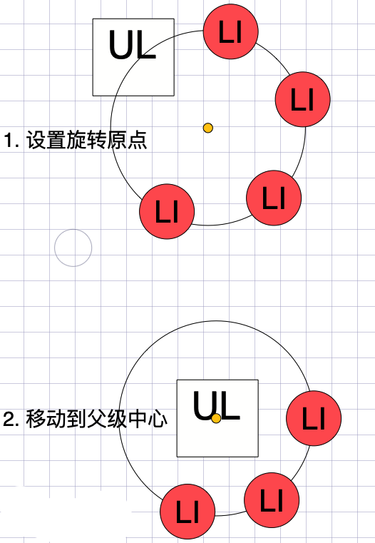
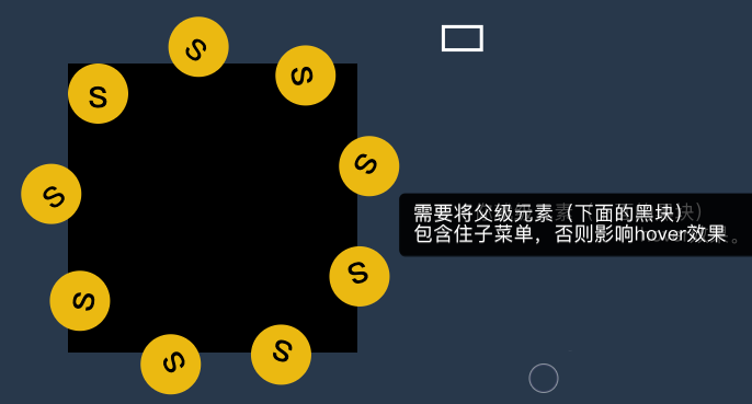
父级有宽度
设置父级ul有宽度,每层都是居中对齐。

<style>
    * {
        padding: 0;
        margin: 0;
        list-style: none;
    }

    body {
        width: 100vw;
        height: 100vh;
        background: #2c3e50;
        display: flex;
        justify-content: center;
        align-items: center;
    }

    nav {
        width: 400px;
        height: 400px;
        background: transparent;
        display: flex;
        justify-content: center;
        align-items: center;
        position: relative;

    }

    nav::after {
        content: 'Menu';
        color: #ecf0f1;
        position: absolute;
        display: flex;
        justify-content: center;
        align-items: center;
        font-size: 2em;
        font-weight: bold;
        text-shadow: 3px 3px 0px #34495e;
        z-index: 1;
    }

    nav::before {
        content: '';
        width: 200px;
        height: 200px;
        background: #e74c3c;
        border-radius: 50%;
        position: absolute;
        left: 50%;
        top: 50%;
        transform: translate(-50%, -50%);
        z-index: 1;
    }

    nav:hover ul {
        transform: scale(1);
    }

    ul {
        width: 300px;
        height: 300px;
        transform: scale(0);
        transition: .5s;
    }

    ul li {
        width: 80px;
        height: 80px;
        background: #e74c3c;
        border-radius: 50%;
        position: absolute;
        display: flex;
        justify-content: center;
        align-items: center;
        font-size: 2.5em;
        color: white;
        transition: 1s;
        transform-origin: 150px 150px;
        box-shadow: 0 0 15px rgba(0, 0, 0.8);
    }

    ul li span {
        transition: 1s;
    }

    nav:hover li:nth-child(1) {
        transform: rotate(40deg);
    }

    nav:hover li:nth-child(1)>span {
        transform: rotate(-40deg);
    }

    nav:hover li:nth-child(2) {
        transform: rotate(80deg);
    }

    nav:hover li:nth-child(2)>span {
        transform: rotate(-80deg);
    }

    nav:hover li:nth-child(3) {
        transform: rotate(120deg);
    }

    nav:hover li:nth-child(3)>span {
        transform: rotate(-120deg);
    }

    nav:hover li:nth-child(4) {
        transform: rotate(160deg);
    }

    nav:hover li:nth-child(4)>span {
        transform: rotate(-160deg);
    }

    nav:hover li:nth-child(5) {
        transform: rotate(200deg);
    }

    nav:hover li:nth-child(5)>span {
        transform: rotate(-200deg);
    }

    nav:hover li:nth-child(6) {
        transform: rotate(240deg);
    }

    nav:hover li:nth-child(6)>span {
        transform: rotate(-240deg);
    }

    nav:hover li:nth-child(7) {
        transform: rotate(280deg);
    }

    nav:hover li:nth-child(7)>span {
        transform: rotate(-280deg);
    }

    nav:hover li:nth-child(8) {
        transform: rotate(320deg);
    }

    nav:hover li:nth-child(8)>span {
        transform: rotate(-320deg);
    }

    nav:hover li:nth-child(9) {
        transform: rotate(360deg);
    }

    nav:hover li:nth-child(9)>span {
        transform: rotate(-360deg);
    }
</style>

<nav>
    <ul>
        <li><span>1</span></li>
        <li><span>2</span></li>
        <li><span>3</span></li>
        <li><span>4</span></li>
        <li><span>5</span></li>
        <li><span>6</span></li>
        <li><span>7</span></li>
        <li><span>8</span></li>
        <li><span>9</span></li>
    </ul>
</nav>
2
3
4
5
6
7
8
9
10
11
12
13
14
15
16
17
18
19
20
21
22
23
24
25
26
27
28
29
30
31
32
33
34
35
36
37
38
39
40
41
42
43
44
45
46
47
48
49
50
51
52
53
54
55
56
57
58
59
60
61
62
63
64
65
66
67
68
69
70
71
72
73
74
75
76
77
78
79
80
81
82
83
84
85
86
87
88
89
90
91
92
93
94
95
96
97
98
99
100
101
102
103
104
105
106
107
108
109
110
111
112
113
114
115
116
117
118
119
120
121
122
123
124
125
126
127
128
129
130
131
132
133
134
135
136
137
138
139
140
141
142
143
144
145
146
147
148
149
150
151
152
153
154
155
156
157
158
159
160
161
162
163
164
165
166
167
168
169
170
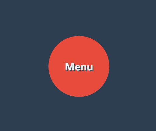
父级无宽度
下面代码父级 UL 没有设置宽度,而是使用边框撑开了空间的效果,基本原理和上面一样。
<style>
    * {
        padding: 0;
        margin: 0;
        box-sizing: border-box;
        list-style: none;
    }

    body {
        background: #34495e;
    }

    nav {
        position: absolute;
        margin: 0 auto;
        left: 50%;
        top: 50%;
        width: 180px;
        height: 180px;
        background: #34495e;
        border-radius: 50%;
        text-align: center;
        line-height: 180px;
        color: #2c3e50;
        font-weight: bold;
        font-size: 2em;
        background: #f1c40f;
        box-shadow: 0 0 15px rgba(0, 0, 0, .5);
        cursor: pointer;
        display: flex;
        justify-content: center;
        align-items: center;
    }

    nav strong {
        position: absolute;
    }

    nav:hover ul {
        transform: scale(1.3);
    }

    ul {
        transform: scale(0);
        border: 150px solid transparent;
        transition: .5s;
        cursor: pointer;
        z-index: -1;
    }

    ul li {
        position: absolute;
        top: -100px;
        left: -100px;
        width: 50px;
        height: 50px;
        background: #e67e22;
        border-radius: 50%;
        display: flex;
        justify-content: center;
        align-content: center;
        line-height: 1.5em;
        transition: all 1s;
        transform-origin: 100px 100px;
        box-shadow: 0 0 15px rgba(0, 0, 0, .8);
    }

    ul li span {
        transition: all 1s;
    }

    nav:hover ul li:nth-child(1) {
        transform: rotate(40deg);
    }

    nav:hover ul li:nth-child(1) span {
        transform: rotate(1040deg);
    }

    nav:hover ul li:nth-child(2) {
        transform: rotate(80deg);
    }

    nav:hover ul li:nth-child(2) span {
        transform: rotate(1000deg);
    }

    nav:hover ul li:nth-child(3) {
        transform: rotate(120deg);
    }

    nav:hover ul li:nth-child(3) span {
        transform: rotate(1680deg);
    }

    nav:hover ul li:nth-child(4) {
        transform: rotate(160deg);
    }

    nav:hover ul li:nth-child(4) span {
        transform: rotate(560deg);
    }

    nav:hover ul li:nth-child(5) {
        transform: rotate(200deg);
    }

    nav:hover ul li:nth-child(5) span {
        transform: rotate(520deg);
    }

    nav:hover ul li:nth-child(6) {
        transform: rotate(240deg);
    }

    nav:hover ul li:nth-child(6) span {
        transform: rotate(480deg);
    }

    nav:hover ul li:nth-child(7) {
        transform: rotate(280deg);
    }

    nav:hover ul li:nth-child(7) span {
        transform: rotate(440deg);
    }

    nav:hover ul li:nth-child(8) {
        transform: rotate(320deg);
    }

    nav:hover ul li:nth-child(8) span {
        transform: rotate(400deg);
    }

    nav:hover ul li:nth-child(9) {
        transform: rotate(360deg);
    }

    nav:hover ul li:nth-child(9) span {
        transform: rotate(720deg);
    }
</style>

<nav>
    <ul>
        <li><span>1</span></li>
        <li><span>2</span></li>
        <li><span>3</span></li>
        <li><span>4</span></li>
        <li><span>5</span></li>
        <li><span>6</span></li>
        <li><span>7</span></li>
        <li><span>8</span></li>
        <li><span>9</span></li>
    </ul>
</nav>
2
3
4
5
6
7
8
9
10
11
12
13
14
15
16
17
18
19
20
21
22
23
24
25
26
27
28
29
30
31
32
33
34
35
36
37
38
39
40
41
42
43
44
45
46
47
48
49
50
51
52
53
54
55
56
57
58
59
60
61
62
63
64
65
66
67
68
69
70
71
72
73
74
75
76
77
78
79
80
81
82
83
84
85
86
87
88
89
90
91
92
93
94
95
96
97
98
99
100
101
102
103
104
105
106
107
108
109
110
111
112
113
114
115
116
117
118
119
120
121
122
123
124
125
126
127
128
129
130
131
132
133
134
135
136
137
138
139
140
141
142
143
144
145
146
147
148
149
150
151
152
153
154
155
156
157
透视景深
perspective
- 使用
perspective来控制元素的透视景深 perspective规则为舞台元素控制景深,perspective属性为控制单个元素
舞台透视
perspective 规则用于将父级整个做为透视元素,会造成里面的每个子元素的透视是不一样的。就像现实中摆一排杯子,是使用统一透视的,每个杯子的透视不一样,造成有大有小。
<style>
    article {
        margin: 0 auto;
        margin-top: 150px;
        width: 400px;
        height: 200px;
        position: relative;
        border: solid 5px silver;
        perspective: 200px;
    }

    article div {
        width: 100px;
        height: 100px;
        background: blueviolet;
        box-sizing: border-box;
        margin-right: 80px;
        float: left;
        transform: rotateY(60deg);
    }
</style>

<article>
    <div></div>
    <div></div>
</article>
2
3
4
5
6
7
8
9
10
11
12
13
14
15
16
17
18
19
20
21
22
23
24
25
26
单独透视
perspective 函数用于为元素设置单独透视,下面是为元素单独设置透视参数,每个元素的透视效果是一样的。
article div {
    width: 100px;
    height: 100px;
    background: blueviolet;
    box-sizing: border-box;
    margin-right: 80px;
    float: left;
    transform: perspective(100px) rotateY(60deg);
}
2
3
4
5
6
7
8
9
3D透视
transform-style
使用 transform-style 用于控制3d透视。
- 应用于舞台即变形元素的父级元素
- 设置
overflow:visible时preserve-3d才无效
| 选项 | 说明 |
|---|---|
| flat | 2D平面舞台 |
| preserve-3d | 3D透视舞台 |
效果体验
下面是设置3D舞台后看到的效果。
<style>
    * {
        padding: 0;
        margin: 0;
        box-sizing: border-box;
    }

    body {
        background: #34495e;

    }

    main {
        position: relative;
        width: 100vw;
        height: 100vh;
    }

    div {
        position: absolute;
        left: 50%;
        top: 50%;
        height: 200px;
        width: 200px;
        transition: 1s;
        background: #e67e22;
        transform-style: preserve-3d;
    }

    div img {
        height: 80%;
        transform: perspective(500px) translateZ(100px);
    }

    div:hover {
        transform: perspective(600px) rotateY(50deg);
    }
</style>

<main>
    <div>
        <img src="1.png" alt="">
    </div>
</main>
2
3
4
5
6
7
8
9
10
11
12
13
14
15
16
17
18
19
20
21
22
23
24
25
26
27
28
29
30
31
32
33
34
35
36
37
38
39
40
41
42
43
44
三维图集 👾
整体图形的角度变形基点和图像旋转的中心应该保持一致,才能看起来是绕着中心旋转 📌
<style>
    body {
        background: #34495e;
    }

    main {
        position: absolute;
        width: 400px;
        height: 200px;
        left: 50%;
        top: 50%;
        transform-style: preserve-3d;
        transform-origin: center center -300px;
        transform: translate(-50%, -50%) rotateX(-45deg);
        transition: 2s;
    }

    body:hover main {
        transform: translate(-50%, -50%) rotateX(-45deg) rotateY(180deg);
    }

    div {
        position: absolute;
        width: 100%;
        height: 100%;
        transform-origin: center center -300px;
        overflow: hidden;
    }

    div img {
        height: 100%;
    }

    div:nth-child(1) {
        transform: rotateY(60deg);
    }

    div:nth-child(2) {
        transform: rotateY(120deg);
    }

    div:nth-child(3) {
        transform: rotateY(180deg);
    }

    div:nth-child(4) {
        transform: rotateY(240deg);
    }

    div:nth-child(5) {
        transform: rotateY(300deg);
    }

    div:nth-child(6) {
        transform: rotateY(360deg);
    }
</style>

<main>
    <div>
        <img src="../1.png" alt="">
    </div>
    <div>
        <img src="../1.png" alt="">
    </div>
    <div>
        <img src="../1.png" alt="">
    </div>
    <div>
        <img src="../1.png" alt="">
    </div>
    <div>
        <img src="../1.png" alt="">
    </div>
    <div>
        <img src="../1.png" alt="">
    </div>
</main>
2
3
4
5
6
7
8
9
10
11
12
13
14
15
16
17
18
19
20
21
22
23
24
25
26
27
28
29
30
31
32
33
34
35
36
37
38
39
40
41
42
43
44
45
46
47
48
49
50
51
52
53
54
55
56
57
58
59
60
61
62
63
64
65
66
67
68
69
70
71
72
73
74
75
76
77
78
观看视角
perspective-origin
📗 perspective-origin用于控制视线的落点,就像我们眼睛看物体时的聚焦点。可以理解眼镜看物体的位置,如看一台汽车,是在看车头左边看还是车头右边看。
需要设置 perspective 透视后才可以看到效果。(一般设置在舞台元素上来控制子元素)
位置参数
| 取值 | 说明 |
|---|---|
| x-axis | 定义该视图在 x 轴上的位置。默认值:50%。可能的值:left、center、right、length、% |
| y-axis | 定义该视图在 y 轴上的位置。默认值:50%。可能的值:top、center、bottom、length、% |
效果体验
<style>
    body {
        background: #2c3e50;
        display: flex;
        width: 100vw;
        height: 100vh;
        justify-content: center;
        align-items: center;
    }

    main {
        border: solid 2px silver;
        width: 400px;
        height: 200px;
        transform-style: preserve-3d;
        transform: rotateY(65deg);
        perspective-origin: right bottom;
        perspective: 900px;
        transition: 2s;
    }

    body:hover main {
        perspective-origin: 1200% bottom;
        /* transform: rotateY(-65deg); */
    }

    div {
        position: absolute;
        width: 200px;
        height: 200px;
        transform: rotateY(60deg);
        overflow: hidden;
    }

    div>img {
        height: 100%;
    }

    div:nth-child(1) {
        background: #e67e22;
    }

    div:nth-child(2) {
        background: #27ae60;
        transform: rotateY(60deg) translateZ(-200px);
    }
</style>
<main>
    <div><img src="3.jpg" alt=""></div>
    <div><img src="5.jpg" alt=""></div>
</main>
2
3
4
5
6
7
8
9
10
11
12
13
14
15
16
17
18
19
20
21
22
23
24
25
26
27
28
29
30
31
32
33
34
35
36
37
38
39
40
41
42
43
44
45
46
47
48
49
50
51
立方体 👾
效果如下
<style>
    * {
        padding: 0;
        margin: 0;
        box-sizing: border-box;
        list-style: none;
    }

    body {
        background: #34495e;
    }

    main {
        position: absolute;
        left: 50%;
        top: 50%;
        width: 200px;
        height: 200px;
        transform-style: preserve-3d;
        transform-origin: 50% 50% 50px;
        transform: translate(-50%, -50%) rotateY(0deg);
        transition: 2s;
    }

    main:hover {
        transform: translate(-50%, -50%) rotate3d(1, 1, 0, 180deg);
    }

    div {
        position: absolute;
        width: 200px;
        height: 200px;
        background: #000;
        display: flex;
        justify-content: center;
        align-items: center;
        font-size: 4em;
    }

    div:nth-child(1) {
        transform-origin: right;
        background: #1abc9c;
        transform-origin: bottom;
        transform: translateY(-200px) rotateX(-90deg);
        opacity: .8;
    }

    div:nth-child(2) {
        transform-origin: right;
        background: #27ae60;
        transform-origin: top;
        transform: translateY(200px) rotateX(90deg);
        opacity: .8;
    }

    div:nth-child(3) {
        transform-origin: bottom;
        background: #e67e22;
        transform-origin: right;
        transform: translateX(-200px) rotateY(90deg);
        opacity: .8;
    }

    div:nth-child(4) {
        transform-origin: top;
        background: #8e44ad;
        transform-origin: left;
        transform: translateX(200px) rotateY(-90deg);
        opacity: .8;
    }

    div:nth-child(5) {
        transform-origin: left bottom;
        background: #ecf0f1;
        opacity: .8;
    }

    div:nth-child(6) {
        transform-origin: left bottom;
        background: #ecf0f1;
        opacity: .5;
        transform: translateZ(200px);
    }
</style>

<main>
    <div>1</div>
    <div>2</div>
    <div>3</div>
    <div>4</div>
    <div>5</div>
    <div>6</div>
</main>
2
3
4
5
6
7
8
9
10
11
12
13
14
15
16
17
18
19
20
21
22
23
24
25
26
27
28
29
30
31
32
33
34
35
36
37
38
39
40
41
42
43
44
45
46
47
48
49
50
51
52
53
54
55
56
57
58
59
60
61
62
63
64
65
66
67
68
69
70
71
72
73
74
75
76
77
78
79
80
81
82
83
84
85
86
87
88
89
90
91
92
93
隐藏背面
backface-visibility
使用 backface-visibility 用于控制是否可以看到元素的背面。
- 一般设置在元素上而不是舞台元素上
- 需要舞台元素(父级元素)设置
transform-style: preserve-3d
| 选项 | 说明 |
|---|---|
| visible | 背面可见 |
| hidden | 背面隐藏 |
翻转卡片
下面使用隐藏背面与透视技术制作的翻转卡片效果。

<script src='https://code.jquery.com/jquery-3.3.1.slim.min.js'></script>
<link rel="stylesheet" href="https://maxcdn.bootstrapcdn.com/font-awesome/4.7.0/css/font-awesome.min.css">
<style>
    * {
        padding: 0;
        margin: 0;
        box-sizing: border-box;
    }

    main {
        position: absolute;
        width: 100vw;
        height: 100vh;
        transition: 2s;
        transform-style: preserve-3d;
    }

    main.login {
        transform: perspective(900px) rotateY(0deg);
    }

    main.register {
        transform: perspective(900px) rotateY(180deg);
    }

    div {
        position: absolute;
        width: 100%;
        height: 100%;
        font-size: 5em;
        display: flex;
        flex-direction: column;
        justify-content: center;
        align-items: center;
        backface-visibility: hidden;
        transition: 2s;
        text-transform: uppercase;
        color: white;
    }

    div span {
        text-transform: lowercase;
        letter-spacing: .2em;
        font-size: .2em;
        color: #2c3e50;
    }

    div:nth-child(1) {
        background: #2ecc71;
        transform: rotateY(0deg);
    }

    div:nth-child(2) {
        background: #e74c3c;
        transform: rotateY(180deg);
    }

    nav {
        position: absolute;
        width: 100%;
        height: 100%;
        z-index: 99;
        text-align: center;
        display: flex;
        align-items: flex-end;
        justify-content: center;
        padding-bottom: 30px;
    }

    nav a {
        padding: 10px;
        text-decoration: none;
        font-size: 1em;
        background: #000;
        color: white;
        margin-right: 10px;
        cursor: pointer;
        left: 0;
        top: 0;
    }
</style>

<main>
    <div>
        <i class="fa fa-home" aria-hidden="true"></i>
        login
        <span>blog.caffreygo.com</span>
    </div>
    <div>
        <i class="fa fa-user" aria-hidden="true"></i>
        register
        <span>blog.caffreygo.com</span>
    </div>
</main>
<nav>
    <a href="javascript:;" onclick="change('login')">登录</a>
    <a href="javascript:;" onclick="change('register')">注册</a>
</nav>
<script>
    function change(t) {
        switch (t) {
            case 'login':
                $("main").removeClass().addClass('login');
                break;
            case 'register':
                $("main").removeClass().addClass('register');
                break;
        }
    }
</script>
2
3
4
5
6
7
8
9
10
11
12
13
14
15
16
17
18
19
20
21
22
23
24
25
26
27
28
29
30
31
32
33
34
35
36
37
38
39
40
41
42
43
44
45
46
47
48
49
50
51
52
53
54
55
56
57
58
59
60
61
62
63
64
65
66
67
68
69
70
71
72
73
74
75
76
77
78
79
80
81
82
83
84
85
86
87
88
89
90
91
92
93
94
95
96
97
98
99
100
101
102
103
104
105
106
107
108
109
110
常见问题
如果发现元素不能点击,可能是父级设置了 transform-style: preserve-3d 属性,且同级元素设置了3D变化特性,造成对点击元素有遮挡。有以下两种方式解决
- 对变形元素设置
pointer-events: none;使用其不接受点击事件 - 删除父级的
transform-style: preserve-3d属性